Archives

Vaccines

Canadians Are Surprisingly Skeptical of Vaccines

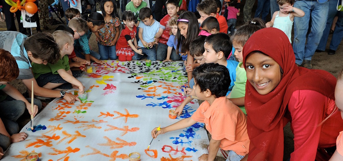
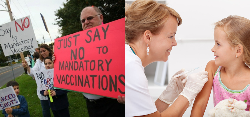
California’s recently signed immunization law, requiring all incoming students in school or daycare to be vaccinated — with no opportunity for religious or personal belief exemptions — is now among the strictest such laws in the United States. As Canadian students return to the classroom this fall, California’s new legislation has managed to shine a spotlight on Canada’s own surprisingly lax attitudes and regulations toward childhood vaccination.

Only two provinces, Ontario and New Brunswick, require students to be vaccinated before attending school. Even then, both provinces also offer generous religious and so-called “philosophical” exemptions to parents who would prefer that their children not be immunized. Ontario is looking to enact even more stringent requirements, proposing that parents who exercise the philosophical exemption must first complete an educational course led by a public health representative. However, this law is far from a done deal, as it continues to wind its way through the provincial legislature.

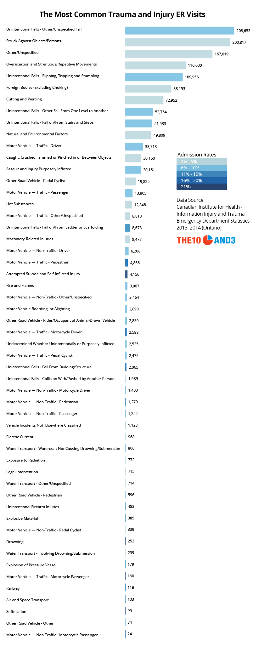
While vaccination rates are indeed reasonably high across much of the country, with nearly nine in ten Canadian children vaccinated against diseases like measles, mumps and rubella, a recent Angus Reid survey revealed that attitudes about the efficacy and need for childhood vaccinations remain stubbornly negative in several provinces.

The Numbers

On its face, the Angus Reid survey reveals that Canadians generally recognize the benefits of vaccines both to their own children, and to the population at large. 88% of respondents say that vaccines are effective in preventing diseases for an individual, and 86% view vaccines as effectively preventing diseases in the community as a whole.

Attitudes on the question 'As a general rule, do you think vaccinations are effective at reducing the chances of catching disease for the individual getting vaccinated?'

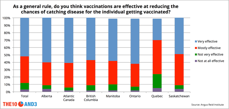
But digging deeper, we see that certain regions of the country, particularly Quebec, view vaccines much more skeptically than in the rest of the country. While over half of Canadians view vaccines as being “very effective” at preventing disease in an individual, only 29% of those in Quebec feel the same way; in fact, 24% of Quebecers view vaccines as being “not very effective” or “not effective at all”, double the skepticism rate of any other province.

Attitudes on the question 'As a general rule, do you think vaccinations are effective at reducing the chances of catching disease for the community as a whole?'

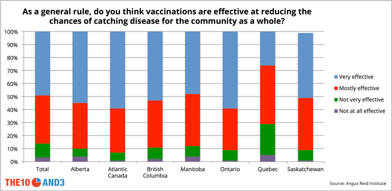
A similar pattern emerges when people are asked about how vaccines improve health in the community as a whole, a key motivating factor in legislation like that in California, which explicitly exempts students who cannot be vaccinated for health reasons (and who may be most vulnerable to the disease in the case of an outbreak). A surprising 29% of Quebecers do not view vaccines as an effective way to reduce disease in the community, nearly triple the skepticism rate of any other province.

Attitudes on the question 'Should vaccinations be mandatory, at least for children in daycare/school, or should it be the parents' choice?'

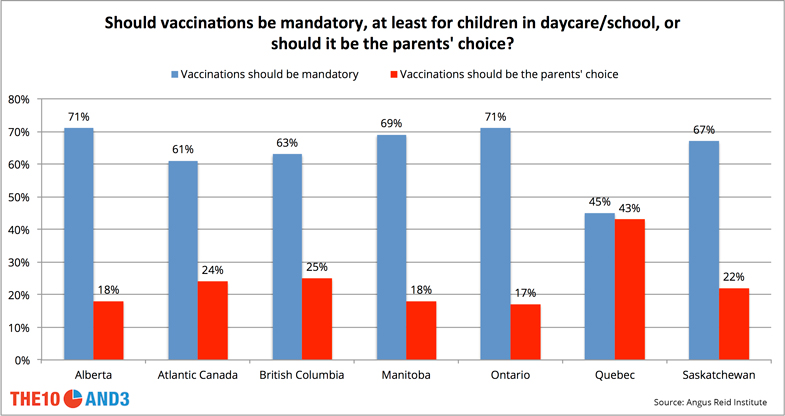
Quebecers’ negative attitudes about the effectiveness of vaccines translates directly into their views about whether vaccines should be mandatory for children in daycare or school. While 63% of Canadians overall think that vaccines should be mandatory for children in school, fewer than half of Quebecers feel the same way.

Why the skepticism?

Attitudes on the science and safety of vaccines

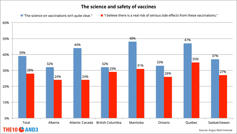
A surprising number of Canadians feel that the science on vaccinations isn’t quite clear (39% total). Respondents in Quebec (48%) and Manitoba (47%) are the most skeptical about the science. Interestingly, skepticism is also negatively correlated with education level: only 27% of university-educated Canadians are leery of the science, while 48% of Canadians with a high school education or less express doubt.

Finally, it seems that those who don’t believe in the science are similarly wary of potential side effects. Over 1 in 3 Quebecers fear serious side effects from vaccinations, followed closely by Manitobans.

So why the skepticism in these regions? The reasons can be hard to pinpoint, but fear stemming from Andrew Wakefield’s discredited 1998 Lancet study linking vaccines to autism still persist in areas, and cultural inertia can be hard to overcome. Given how many adults in Canada, and in particular Quebec, are wary of both the science and the potential side effects, provincial legislatures will no doubt hesitate before enacting stricter rules. As these attitudes persist, we can expect further outbreaks of preventable diseases like the measles, which infected hundreds of Canadians in the most recent large outbreak in 2015.

Don’t miss our newest stories! Follow The 10 and 3 on Facebook or Twitter for the latest made-in-Canada maps and visualizations.

Don't miss our newest maps, charts and stories. Sign up now to have them delivered to your inbox.

Getting to Work in Calgary

How People in Calgary Get to Work

As the fastest growing metropolitan area in Canada, Calgary is starting to face its share of big city problems: a surging crime rate, a tumultuous housing market tied to global oil prices, and perhaps most grating of all, the worsening gridlock.

When we looked at the state of traffic in Canada, Calgary’s congestion turned out to be similar to some of the country’s worst offenders, including Vancouver and Ottawa. But despite the city having a reputation for its reliance on cars, Calgary is working hard to diversify its transit options before traffic goes from bad to worse. Public transit is being embraced, with an aggressive plan to expand the city’s popular LRT system, while improved cycling and walking infrastructure is gradually being introduced to a hesitant populace.  

To understand the mix of transportation options used by Calgarians, we dove into the data to see how residents of the Stampede City manage to get to and from their jobs, be it by car, bike, foot, or public transit. Using data from the 2011 National Household Survey, we sliced up the city into census tracts, and mapped what percentage of employed residents in each area use each mode of transit as their main method to get between home and work.

Driving

Not surprisingly, Calgary is a city dominated by vehicles of the 4-wheeled variety as almost 9 in 10 of its residents live in low density suburban environments. The map makes it very clear: outside of the city centre, more than three quarters of commuters are hitting the road each day for what can be a long and grueling trip. Only deep in the city centre does the reliance on cars dip substantially, yet even there, over 20% of Calgarians are driving to work.

Public Transit

At first glance, Calgary’s public transit usage numbers do not look encouraging. Fewer people rely on buses and trains in Calgary (17%) than in Toronto (24.3) Montreal (23.1) or Vancouver (20.8%), and those cities arguably feature a similarly entrenched car culture.

But the news is not all grim. With Calgary’s historical efforts to stem the reach of highways into downtown and limit the number of parking spaces in the city centre, driving is not made to be a particularly attractive option. So it makes sense how the C-train, which opened in 1981, has become such a success, boasting the second highest ridership among all light rail systems in North America. Public transit usage appears to continue growing in Calgary, despite the city’s continual sprawl in all directions.

Indeed, along much of the blue and red lines of the C-train, upwards of 20% of commuters use public transit as their primary mode of transportation, with a peak of 36.1% of commuters in the Downtown West End. Compare this to our study of Toronto, however, where over 60% of residents rely on public transit in that city’s hottest spots.

Walking

Let’s face it. In a city as spread out and car-centric as Calgary, it’s tough to get to work by foot. Nevertheless, over 40% of downtown residents eschew the comforts of a car or train (or bike) to commute to work, even in the winter. The city recently developed its first major pedestrian strategy, Step Forward, which is an ambitious effort to expand walking to more people in the city. Some of the recommendations, like improving intersection signals, building pedestrian overpasses and installing new lighting, address purely infrastructure concerns, while other education efforts, like encouraging homeowners and businesses to promptly clear ice and snow from their properties, requires a cultural shift that may be harder to attain.

Cycling

Calgary is certainly not known for its cycling culture, and usage patterns reflect this as the percentage of commuters who cycle to lower is much lower than in cities like Toronto and Vancouver. Nevertheless, the numbers suggest that cycling is on the rise, particularly in neighbourhoods like Parkdale and Ramsay. Since counters began tracking rides in 2014, ridership rose 200% at several locations along Fifth Street S.W. and jumped more than 300% on parts of 12th Avenue S.W. Outside of a few select areas within the city, however, cycling appears to be a non-starter for most commuters, registering as the preferred choice of fewer than 2% of people going to work.

Methodology

Statistics Canada collects commuting data for employed residents over the age of 15. Each mode of transit we consider must be a resident’s main mode of transport to travel between home and work in order to be counted. Census tracts represent the most granular slicing of a city that Statistics Canada considers, and typically represents an area with between 2,500 and 8,000 residents.

Don’t miss our newest stories! Follow The 10 and 3 on Facebook or Twitter for the latest made-in-Canada maps and visualizations.

Don't miss our newest maps, charts and stories. Sign up now to have them delivered to your inbox.

From Banff to Tuktut Nogait: How Popular Are Canada’s National Parks?

As part of Canada’s upcoming 150th birthday celebrations, Parks Canada announced free admission to all of the country’s national parks and historic sites throughout 2017. As anyone who’s visited Banff or Jasper during peak season knows all too well, the crowds of eager tourists exploring the Rockies’ splendour grows more intimidating each year. The prospect of managing 2017’s anticipated hordes of visitors to these national gems is therefore worrying, particularly for those at the helm of Parks Canada.

But in reality, most national parks in Canada remain severely underutilized, whether due to their remoteness — like the Northwest Territory’s Aulavik National Park, 600 km north of the Arctic Circle — or simple low-key obscurity, like the New Brunswick camper’s paradise of Kouchibouguac.

Canadian National Parks and Reserves Annual Average Attendance

Only a handful of Canada’s most well-known national parks and marine reserves have the kind of overwhelming attendance numbers that keep park rangers up at night. Banff, with over three million visitors per year, is both Canada’s oldest national park (established in 1885), and its most popular, containing gems like Lake Louise and the Cave and Basin thermal springs. Just to the north, along the Canadian Rockies, lies Jasper National Park, which attracts approximately two million visitors per year to sites like the Columbia Icefield glaciers and Pyramid Mountain. Lest these parks are too overrun, fear not: just to the west is Yoho National Park, while further south is Kootenay National Park, each equally spectacular to their more famous Rocky Mountain neighbors.

On the other end of the spectrum are Canada’s most sparsely attended national parks, which quite predictably are located in some of the country’s harshest and most remote environments. Sirmilik, on the northern tip of Nunavut’s Baffin Island, and Quttinirpaaq, hundreds of kilometres to the north on Ellesmere Island, register just a few dozen hearty visitors per year to their mostly barren polar landscapes. Tuktut Nogait National Park, at the northern end of Northwest Territories, typically welcomes fewer than 10 brave souls, though those who do visit may witness the spectacular herds of Bluenose West caribou migrating to their calving grounds within the park.

Top 20 Historic Sites by Annual Average Attendance

Canadian National Historic Sites Annual Average Attendance

Besides the giant expanses of the country’s national parks, Parks Canada also maintains an extensive network of national historic sites, which include everything from forts and mines, to trails, canals and historic houses. The most popular among them is Quebec City’s walled fortifications, attracting 1.5 million visits per year. Other well-attended sites include Halifax’s historic Citadel (500,000 visitors/year), Ottawa’s winter-skating paradise Rideau Canal (approx. 900,000 visitors/year), British Columbia’s breathtaking Rogers Pass (over 400,000 visitors/year) and Prince Edward Island’s literary landmark the Green Gables House (over 100,000 visitors/year).

Don’t miss our newest stories! Follow The 10 and 3 on Facebook or Twitter for the best made-in-Canada visualizations and data stories.

Don't miss our newest maps, charts and stories. Sign up now to have them delivered to your inbox.

Best Canadian Books

The Most Loved Canadian Books – What The Data Says

When asked for the names of the best Canadian authors, names such as Nobel Prize winner Alice Munro, Booker Prize winner Joseph Boyden and Arthur C. Clarke Award winner Margaret Atwood come to mind. Popular “best of” lists like those of the CBC and the Literary Review of Canada are similarly packed with classic and important works like Mordechai Richler’s Barney’s Version, Stephen Leacock’s Sunshine Sketches of a Little Town and Timothy Findley’s The Wars. But are these the Canadian books, and authors, that people actually enjoy reading the most?

Rather than ask the critics, we wanted to create a list that reflects the tastes of the reader. Similar to our previous ranking of the best Canadian movies, we set out to find what Canadian books people actually love to read. To do this, we compiled the ratings and reviews of every listed Canadian book on the most popular online reading community, Goodreads.com; we created a weighted ranking, taking into account both the book’s number of reviews and average rating. The result is a ranking that attempts to reflect the best Canadian books, as viewed by the average reader.

Canadian Book Rankings

The top ten Canadian books are all quite different, in many ways reflecting Canada itself. Speaking to Canada’s openness and diversity, the Canadian book most beloved by Goodreads voters, A Fine Balance, is written by a first generation Canadian about struggles in his homeland. Second on the list is perhaps Canada’s most iconic book, Anne of Green Gables, representing classic Canadian culture and setting. Third is The Book of Negroes, telling the chilling tale of slavery and hardships faced by black people in our country’s early history. Rounding out the top ten are books ranging from historical dramas to dystopian fiction, catering to the entire spectrum of Canadian readers.

To little surprise, Margaret Atwood is the best represented author on our list, with five novels. Other repeat authors include Susanna Kearsley, L.M. Montgomery, Kelley Armstrong, Joseph Boyden and Guy Gavriel Kay. The two most frequently rated Canadian books on the list are Life of Pi and Water For Elephants, having being read and reviewed on Goodreads over 1.3 million times each. The next most popular books are The Handmaid’s Tale, Room, and Anne of Green Gables, which have all been read and reviewed more than 600,000 times.

The books on our list span over 108 years of Canadian literature, ranging from Anne of Green Gables written in 1908, to the brand new Rebel of The Sands by Alwyn Hamilton, from 2016. The median publication year for books on our list is 2005. This result is hardly surprising; the Goodreads audience skews young, and the site was only founded in 2006, so books written before this would need to be retroactively added. However, as time progresses and society moves forward, older books are not only read less frequently, but hold less meaning to the current audience.

In total, 34 of the 50 books on our list were written by female authors. This represents a departure from other Canadian best-of lists such as the CBC’s ranking of the top 100 books, where only 50% of the works were written by female writers. The women’s literary organization VIDA argues that the majority of reviewers for prominent literary publications are male, thereby potentially biasing best sellers list and critical rankings towards books written by male authors. A competing hypothesis for this discrepancy is offered by Goodreads, based on an analysis of their own rating data: both women and men on the site tend to rate books authored by women higher than those authored by men.

Methodology

Goodreads data was gathered in April 2016. Ratings on Goodreads are assigned on a 1-5 scale, and can be submitted by anyone with an account on the site. To qualify for our list, the author must either have Canadian citizenship, or have lived much of their life in Canada.

The rankings were created using a Bayesian rating formula, the same one used by IMDB for the IMDB top 250 – and our ranking of the best Canadian movies.

adjusted rating = (v/(v+m))R+(m/(v+m))C, where

  • R = average Goodreads rating for the book
  • = the number of Goodreads ratings that the book received
  • m = parameter that effectively down weights books with fewer ratings (in our case m = 25000)
  • C = average rating across all books on Goodreads

For books that are part of a series, we have chosen to only rank the first book. Sequels are likely to have only been read by people who enjoyed the first book, thus skewing their ratings, as all readers are already predisposed to liking the book. We also have chosen to exclude romance and erotica novels from our list for a similar reason. Goodreads has a very large and dedicated audience of erotica and romance readers. Similar to sequels, books in these genres are often avoided by most other readers, and consequently, receive an inflated Goodreads rating.

Don’t miss our newest stories! Follow The 10 and 3 on Facebook or Twitter for the best made-in-Canada visualizations and data stories.

Don't miss our newest maps, charts and stories. Sign up now to have them delivered to your inbox.

Tower of Babel: Canada’s Languages Visualized in an Interactive Map

Canada has a well-deserved reputation as one of the most diverse nations on Earth. One in five Canadians reported speaking a language other than English or French, and over 200 distinct mother tongues were reported to the census in 2011. In Canada’s biggest and most multicultural city, Toronto, over half the population is foreign born, with over 140 languages or dialects spoken within the megacity’s limits.

Last year, to visualize this remarkable diversity, we constructed a language map showing the most common non-official language in each region of the country. With Tagalog dominating in the Yukon, German in the Prairies and Chinese in the country’s big cities, it was fascinating to see how the most common immigrant languages have spread throughout the nation.

But many very sizable immigrant languages still flourish in Canada’s cities and countrysides despite not dominating in any particular region. So we built a map showing the geographical distribution of every single language reported to the Canadian census in 2011. To view the map, click the image below.

Mobile Map Screenshot

Russian, for instance, is the primary language spoken at home for over 100,000 residents in Canada. Almost half of these speakers reside in the city of Toronto or suburban York region to the north, with the remainder in mostly big cities like Montreal and Vancouver. Punjabi, with well over 300,000 speakers, has giant communities in Greater Vancouver and Ontario’s Peel region, but virtually no presence east of Toronto. Canada’s Arabic-speaking community, on the other hand, with over 180,000 members, is focused primarily in Montreal, with smaller pockets in Toronto, Ottawa, Calgary and Windsor.

Yet even smaller immigrant communities display fascinating geographic patterns. The 20,000-strong Japanese-speaking community resides almost exclusively in and around Vancouver, while the country’s modest group of Finnish speakers (numbering just over 3000) is concentrated in northern Ontario.

Methodology

For the map, we divided the country into census divisions, and for each language we display the number of residents in that division that report primarily speaking the language at home, based on data from the 2011 census.

As in our previous map, all Chinese dialects are grouped together. Why? Statistics Canada permits census respondents to indicate both a specific dialect of Chinese (e.g. Cantonese, Mandarin, Shanghainese, Hakka, etc.) or simply “Chinese”. Most respondents to the census select “Chinese” rather than their particular dialect, so there is unfortunately no way of knowing accurate numbers for individual dialects. As such, we decided to combine all Chinese dialects plus the generic “Chinese” into a single category.

Don't miss our newest maps, charts and stories. Sign up now to have them delivered to your inbox.

The Tragically Hip

The Tragically Hip Are Canada’s Most Successful Band Ever

With the sad news that Tragically Hip frontman Gord Downie is suffering from terminal brain cancer and embarking on his final tour, poignant tributes referring to the Kingston rockers as “Canada’s Band” are now a common sight.

The Hip’s legacy of quintessential Canadiana is second-to-none — their songs are peppered with wistful references to sleepy towns like Bobcaygeon and Thompson, and unforgettable stories like those of David Milgaard and Bill Barilko. But besides being known for a catalogue that is thoroughly steeped in the culture of this nation, does The Hip deserve a place among the pantheon of great Canadian musical acts? Has their music truly captured the attention of a broad swath of the Canadian public? After digging into historical Canadian album charts, and considering metrics like weeks at #1, longevity, and breadth of album success, the answer could not be more clear: The Tragically Hip are without a doubt Canada’s most successful and well-loved band of the past 50 years.

Weeks at the Top

For this analysis, we looked at Billboard’s top Canadian album charts, which are published weekly and go back to 1968. These charts measure the top selling albums in Canada — including all artists, not just Canadian ones — and include sales of physical albums, digital downloads, and more recently have started to include streaming as well. Arguably album sales is one of the most comprehensive and meaningful metrics of an artist’s popularity, as it suggests a full appreciation of an artist’s work by the listener.

Weeks at Number One

The first bona fide bands to make the list are The Hip and Nickelback, each enjoying 17 weeks at #1 on the Canadian charts over their careers (they are joined at 17 weeks by solo rocker Bryan Adams). After these two, it’s a steep drop before any Canadian band ranks again; The Hip and Nickelback have been the only groups to enjoy the kind of commercial success it takes to consistently top the charts. The Barenaked Ladies check in at 8 weeks (due exclusively to their debut 1992 album Gordon), and remarkably, no other band, including stalwart rockers like Rush and The Guess Who, even cracks five weeks.

Though we’re most interested in identifying the most important bands in Canadian music, it’s worth noting the success of several solo artists when it comes to album sales. The undisputed queen of the Canadian charts is Celine Dion, whose multitude of top-selling albums — which span the gamut from original material to covers to greatest hits compilations, in both English and French — have spent a remarkable 39 weeks at #1. Solo pop stars Alanis Morissette and Shania Twain follow next with 23 and 21 weeks respectively, though their dominance at the top of the charts is due primarily to the success of a singular, career-defining album (Morissette’s Jagged Little Pill dominated for a ridiculous 22 weeks in the mid-90s, while Twain’s country-pop Up! spent almost three months at #1 in the early 2000s).

Breadth

Total Number Ones

Counting the weeks at #1 is useful, but it doesn’t tell the whole story, particularly since just one or two hit albums can make an artist’s numbers look gaudy. So we next considered the number of an artist’s albums that reached the top of the charts.

Again, nobody holds a candle to Celine Dion. She can sing from the phone book and it’ll probably go #1. But it’s arguably a much more impressive achievement for a rock band like the Hip to have topped the charts with an astounding nine albums (four more than any other band). Starting with their second album, Road Apples, which led for a single brief week in 1991, every subsequent Hip album through the 1990s spent at least a couple of weeks at #1, including classics Fully Completely (1992), Trouble at the Henhouse (1996) and Phantom Power (1998). While none of the Hip’s albums dominated sales the way that Jagged Little Pill did for Alanis Morissette, the band’s 1994 hit Day for Night did manage an impressive four weeks atop the charts. That’s really impressive, given that they were competing directly against R.E.M.’s Monster and Boyz II Men’s II, huge albums which were dominating the US charts at that time.

Longevity

Longevity

Here, we consider the time between an artist’s first and last album to hit #1, which suggests how long the artist has managed to stay in the public’s consciousness. Looking at the data in this way, we notice some remarkable outliers. Neil Young has had precisely two #1 albums in Canada: the 1971 masterpiece Harvest and 2007’s Live at Massey Hall 1971. You’ll notice that the latter album was released 36 years after it was recorded, which somewhat negates the argument for Neil Young’s creative longevity. Nevertheless, it is a testament to Canada’s love for the political rocker that his classic performances still sell almost four decades after being first performed. Ageless rockers Rush have also had exactly two #1 albums in Canada, Signals and Clockwork Angels, separated by a chasm of 30 years. The Tragically Hip, on the other hand, boast a chart-topping longevity of 18 years, and more importantly have densely filled that time with nine hit albums (their forthcoming record Man Machine Poem will likely extend these gaudy numbers).

No Band Touches The Hip in Canada

When considering all of these key metrics together — chart dominance, album breadth, longevity — it’s clear that no other Canadian band even comes close. Bands like Nickelback, Rush and Arcade Fire have been quite successful within the country, and have in some cases achieved great success outside of it. But no matter how you slice the data, The Tragically Hip are Canada’s most vital and well-loved band.

Methodology

Data is drawn from the Billboard Top Canadian Albums chart, published weekly since 1968. Data is accurate as of 6/15/2016. You may be wondering about where Drake is. As of the publication date, Drake has led the Canadian charts for a total of 10 weeks across six separate albums, and will likely rise sharply in the rankings over the coming years.

Don’t miss our newest stories! Follow The 10 and 3 on Facebook or Twitter for the latest made-in-Canada maps and visualizations

Don't miss our newest maps, charts and stories. Sign up now to have them delivered to your inbox.

Torontonians Going To Work

How People in Toronto Get to Work

Toronto is in the midst of a grinding debate on how to modernize the region’s transit system, with a pared down version of mayor John Tory’s SmartTrack proposal looking increasingly like the last plan standing.

While Torontonians patiently wait for relief from the city’s notorious congestion – both on the roads and on public transit – they still need to find a way to get to work. Previously, we mapped public transit usage across the city, and found some surprising patterns of bus and subway reliance, particularly in the city’s lower income areas. But under a quarter of Torontonians rely on public transit for their commutes, so it painted a relatively incomplete picture.

We dove back into the data to see how residents of the Greater Toronto Area manage to get to and from their jobs, be it by car, bike, foot, or public transit. Once again,using data from the 2011 National Household Survey, we sliced up the city into census tracts, and mapped what percentage of employed residents in each area use each mode of transit as their main method to get between home and work.

Driving

This map serves as a stark reminder of how much residents of the GTA rely on their cars. Outside of the city of Toronto, upwards of 90% of commuters hit the streets and highways each morning in a car. But really, what other choice do they have? With the city now stretching dozens of kilometres to the east, north and west into sprawling, low-density communities, there is virtually no alternative to sitting behind the wheel besides using relatively inefficient suburban bus networks like York Region’s Viva and Mississauga’s MiWay.

But even within the city, at close proximity to subway stations along the Yonge or Bloor lines, well over half of Torontonians are choosing to drive to work in some areas. Only deep in the downtown core does the reliance on automobiles ease off, and even there, over 20% of commuters take their cars.

Walking

Not surprisingly, in a city as spread out (and cold) as Toronto, few people are commuting on foot. Outside of the downtown core, where upwards of 50% of residents walk to work in high density areas like Bay and Dundas, fewer than 1 in 10 Torontonians have the luxury of strolling past snarled traffic and packed buses.

But if you look closely, you’ll find some interesting pockets of foot-powered commuters. To the north, near York University, 13% of commuters walk; to the east, by Ajax’s town hall, over 15% walk to work in what is a fairly dense commercial neighborhood; and to the southwest, in downtown Oakville, 1 in 6 commuters travel by foot within the city’s lively retail strip.

Cycling

Like walking, commuting on two wheels in Toronto can be quite a challenge, due to the weather, the vast distances, and the relative lack of bike lanes. Cyclists are similarly concentrated downtown; but unlike walkers, who are most abundant in the corridor between Bathurst and Jarvis, commuting cyclists stretch much further east and west, though not much further north than Bloor Street.

Outside of the downtown core, however, cycling is pretty much dead. In the vast expanses of Etobicoke, North York, Scarborough and further points out, virtually no commuters report cycling as their main mode of transport.

Public Transit

As we discovered in our previous map on public transit in Toronto, the biggest hotspots for public transit use are to be found, not surprisingly, along the city’s major subway lines, particularly the Bloor-Danforth line, but also in high concentration near bus-train transfer hubs like Eglinton (51.3% of residents) and Finch (57.4%) stations. Farther afield, GO stations like Mimico in the southwest and Rouge Hill in the east are magnets for train commuters, while residents along the busy Finch 36 bus line in the northwest of the city have no choice but to board overcrowded and woefully infrequent buses to get to work.

Methodology

Statistics Canada collects commuting data for employed residents over the age of 15. Each mode of transit we consider must be a resident’s main mode of transport to travel between home and work in order to be counted. Census tracts represent the most granular slicing of a city that Statistics Canada considers, and typically represents an area with between 2,500 and 8,000 residents.

Don’t miss our newest stories! Follow The 10 and 3 on Facebook or Twitter for the latest made-in-Canada maps and visualizations.

Don't miss our newest maps, charts and stories. Sign up now to have them delivered to your inbox.

Andrew Wiggins Shoes

The Shoes Worn by Canadian NBA Players

Cory Joseph was born in Toronto, and after a stop in San Antonio at the beginning of his career, he has returned to his hometown where he plays for the Toronto Raptors. Although he is a role player on the team, he has been an integral part of the Raptors’ success over the past two seasons. Joseph currently wears the Nike Kyrie 2, the signature shoe of Kyrie Irving. His teammate, Giannis Antetokounmpo, wears the Nike Kobe AD.

Andrew Wiggins is only 21 years old but he is making a large impact in his 3rd year in the league with the Minnesota Timberwolves. Averaging over 22 points per game to go along with 4 rebounds and 2 assists, Wiggins is set to have a long career in the NBA. He currently wears the Adidas Crazy Explosive, an unusual shoe that looks like a wrestling boot.

Tyler Ennis spent only one year in college at Syracuse before making the leap to the NBA in 2014. He currently is average about 6 minutes per game with the Houston Rockets and is looking to improve on a slow start to the 2016-17 season. Ennis wears the Jordan Melo M13, Carmelo Anthony’s signature shoe.

Trey Lyles was selected with the 12th overall pick by the Utah Jazz two years ago and averaged over 17 minutes per game in his first season. He is the first person from Saskatoon, Saskatchewan to play in the NBA. Lyles typically wears shoes from the Kobe line and most often sports the Nike Kobe 3.

Jamal Murray, the talented young Canadian from Kitchener, Ontario, is in his first year in the league after spending only a single year at Kentucky. The highly touted rookie signed a multi-year deal with Adidas before the draft. He is currently wearing the Adidas D Lillard 2, the second signature shoe in Damian Lillard’s line.

A former All-American with Gonzaga, Toronto-born Kelly Olynyk has asserted himself as a consistent backup centre for the Boston Celtics after undergoing shoulder surgery in the offseason. He has been a reliable member of Canada’s national basketball team over his career, and is a big reason why Team Canada came ever-so-close to qualifying for the 2016 Olympics in Rio. Olynyk is currently wearing Nike Kobe 11 shoes.

Dwight Powell, a role player out of Stanford, has seen his minutes per game double over the past two seasons. From Toronto, Ontario, the 6’11” centre has improved each of his three seasons in the league. Powell frequently wears the Nike Zoom Lebron Soldier 8, an older version of one of Lebron James’ secondary shoes.

Nik Stauskas, a former 8th overall pick, has played an important role in the success of the suddenly resurgent Philadelphia 76ers. He represented Canada at the 2015 FIBA Americas Championship but did not play in the team’s final game due to food poisoning. Stauskas wears the popular Nike Hypershift.

Tristan Thompson won his first NBA Championship last season alongside teammates Lebron James, Kyrie Irving and Kevin Love. The former 4th overall pick, is known for his defensive abilities. He currently wears the Nike Zoom Lebron Soldier X.

Journeyman Joel Anthony, a native of Montreal, is a newly minted teammate of superstar Kawhi Leonard after signing with the San Antonio Spurs for the remainder of the 2016-17 season. He’s been a Nike and Jordan brand wearer his entire career, most recently sporting Nike Air Max Hyperposite shoes.

The Players and Their Shoes

Player Shoe
Tyler Ennis Jordan Melo M13
Cory Joseph Nike Kyrie 2
Trey Lyles Nike Kobe 3
Jamal Murray Adidas D Lillard 2
Kelly Olynyk Nike Kobe 11
Dwight Powell Nike Zoom Lebron Soldier 8
Nik Stauskas Nike Hypershift
Tristan Thompson Nike Zoom Lebron Soldier X
Andrew Wiggins Adidas Crazy Explosive
ER Waiting Room

What Types of Injuries Are Packing Canada’s ERs?

With ERs in cities across the country facing unacceptably high wait times, we were curious what sorts of visits are causing all of the congestion in these critical facilities. Is the rise in concussions and brain injuries among children to blame for the overcrowding, or are simple cuts and scratches unnecessarily packing ERs with many folks who could otherwise be treated at home?

We turned to the Canadian Institute for Health Information, which classifies injury and trauma ER visits (though not visits for infectious ailments like the flu) to emergency rooms across the country, to help us understand. As we’ve noted in past studies on the state of healthcare in Canada, data collection in this country is extremely uneven, and typically missing for vast swaths of the population, including entire regions and even provinces. There was no difference this time around. Fortunately, the country’s most populous province, Ontario, maintains excellent data reporting for injury and trauma visits across its entire network of emergency rooms, so we focus here exclusively on Ontario’s statistics.

The Most Common Trauma and Injury ER Visits - Ontario

Perhaps unsurprisingly, falls comprise the largest single cause of injury and trauma ER visits across Ontario hospitals (over 200,000 in a year). This broad category includes injuries due to falls suffered on the ice and snow, on the playground, or from beds, chairs and other areas of the home.

The second largest category, comprising another 200,000 annual ER visits in Ontario, involves injuries due to being struck by objects — typically in the context of sports activities or contact with broken glass and other household accidents — or being struck by people — again, typically in the context of sports activities. Finally, another large chunk of visits (116,000) comes from overexertion, which includes injuries due to heavy lifting or other strenuous physical activity.

While such injuries can indeed be serious, hospital admission rates due to these largest categories are relatively modest, at well under 10%. Several other types of visits, which each contributed only a few hundred ER visits in Ontario, resulted in much more serious rates of admission: suffocation (44%), injuries to motorcycle passengers (26%), drowning (20%) and injuries to motorcycle drivers (18%).

Finally, a few particularly notable categories also stand out. Injuries resulting from legal intervention resulted in over 700 annual visits to Ontario ERs; these are injuries inflicted by police or other law enforcement in the course of arrests, maintaining order or other legal actions.

Another 485 annual visits were due to the unintentional discharge of firearms, 15% of which were serious enough to warrant hospital admission.

Methodology

The CIHI data includes only ER visits classified as being an injury or trauma in this analysis, covering the time period April 1 2013 through March 31 2014. While the CIHI does collect some data for several provinces, only the data for Alberta and Ontario include all emergency facilities within those provinces; for simplicity, we’ve chosen to present data only for Ontario. We note that there is no reason a priori to suggest that the trends across the entire country should be meaningfully different than those in Ontario. This document provides details on the classification definitions used by the CIHI.

Don’t miss our newest stories! Follow The 10 and 3 on Facebook or Twitter for the latest made-in-Canada maps and visualizations

Don't miss our newest maps, charts and stories. Sign up now to have them delivered to your inbox.

Crowning the World’s Undisputed Hockey Hotbed

Last year, we declared Thunder Bay to be the hockey capital of Canada. Season after season, this unassuming, northern Ontario town sends boatloads of its young men into the ranks of the NHL. And the data doesn’t lie — over the past century, no other Canadian city has so consistently churned out hockey players at such a high rate.

But many readers were aghast: how could we ignore the Prairies? In those parts, while some players do come from mid-sized cities like Regina or Red Deer, so many more hail from a vast constellation of tiny towns – with names like Oxbow, Aneroid and Elk Point – that dot the endless prairie landscape. A small town certainly cannot consistently produce NHL-ready players year after year, so it simply has no chance in our analysis when facing larger cities like Thunder Bay. But when you start to analyze all of these small towns aggregated across a larger region, like a province, then you may just realize how dominant the hockey tradition in Canada’s west really is.

Others wondered about the huge influx of players in the NHL born outside of Canada, who now comprise over half of the league. The American invasion was well underway by the early 1980s, with stars like Chris Chelios and Pat LaFontaine contributing a familiar brand of hard-nosed, yet skilled North American hockey. By the late 1980s, the ranks of European and Soviet players in the NHL exploded, bringing with them an elegant game based on skating and puck possession.

We’re here to tell you: while Thunder Bay remains Canada’s best hockey town, Saskatchewan is the world’s undisputed hockey hotbed – a province that has consistently produced more NHL-ready players per capita than any other region in Canada, or on the planet.

Mapping the Hockey Universe

To recognize the rich and diverse pedigree of the world’s best hockey players, we built an interactive heatmap showing the birthplace of NHL players from around the world over time, stretching from the league’s early years in 1925 to today. To analyze the heated regional rivalries in North America, we sliced up Canada into provinces and territories, and the United States into states, while players from outside of North America were assigned only to their country. Regions on our map were assigned a colour intensity based on the number of players born there; the higher the number of players relative to the region’s population, the brighter the colour.

Mobile Map Screenshot

Canadian Provinces Still Rule the Roost

It should come as no surprise that Canadians have dominated the ranks of the NHL since the league’s inception in 1917. In the early years, most players hailed from Ontario and Quebec, but by the 1930s, western Canada started contributing its share of stars, including multiple Hart-trophy winner Eddie Shore and dominant goaltender Tiny Thompson. It took several more decades for every province to be represented in the league (Alex Faulkner was the first from Newfoundland and Labrador, playing as a rookie for the Red Wings in 1962-63).

But looking at the historical data, one trend is absolutely clear: Saskatchewan is far and away the most dominant hockey region in Canada, surpassing every other province and territory according to players per capita, in every decade since the 1950s (last season, Saskatchewan had 3.6 NHL players per 100K residents). For most of the last forty years, over 50 NHL players per season called Saskatchewan home, remarkable for a province whose population has consistently hovered at about 1 million. The only provinces to even come close are neighbours Manitoba and Alberta (2.4 and 1.8 players per 100K residents, respectively), and you may as well just forget about any region outside of Canada.

The United States of Hockey

Minnesota. Michigan. North Dakota. Massachusetts. These northern states, along with a handful of others, form the backbone of the USA’s formidable contribution to the rosters of NHL teams. Minnesota, in particular, has been the most prodigious hockey state for several decades, and represents the birthplace of some of the league’s toughest and most talented players (Dustin Byfuglien, David Backes, Ryan McDonagh, Zach Parise). At the same time, however, Minnesota’s per capita numbers (0.8 per 100K residents last year) are still nowhere near those of Saskatchewan, and in fact have tended to be on par with Canada’s lowest performing province, New Brunswick.

One exciting consequence of the league’s expansion throughout the United States is that even some warmer states are starting to contribute large numbers of players to the NHL. While many of these players soon moved to more frigid climates where they honed their craft — Brooks Orpik (California to New York), Tyler Myers (Texas to Alberta), Sean Couturier (Arizona to New Brunswick) — some, like Oklahoma’s Matt Donovan, learned the basics locally before playing collegiate hockey in more traditional places.

The European and Soviet Invasion

There had always been a small handful of Europe-born players since the early days of the NHL. 1930s-era Blackhawks star Johnny Gottselig was born in present-day Ukraine but cut his teeth playing shinny in Regina; 1949 Calder winner Pentti Lund was born in Finland but credits his childhood in Thunder Bay for turning him into a hockey player.

But it wasn’t until the late 1970s and early 1980s when the ranks of Europeans in the NHL really  exploded. Sweden and Finland led the way, sending stars like Borje Salming, Pelle Eklund and Jari Kurri, who made immediate impacts on their NHL clubs. In a few years, the Czechs and Slovaks started arriving in numbers (prior to the dissolution of Czechoslovakia), but it was the 1989-90 season which stands as a pivotal year in the true internationalization of the NHL: the arrival of the Soviets. That season marked the the first NHL campaigns for Alexander Mogilny (who had defected earlier that year), Igor Larionov, Sergei Makarov and a handful of other Soviet greats. Within a few years, superstars Sergei Federov and Pavel Bure arrived to dazzle Western fans with speed and skill, and the league had changed forever. In the intervening years, while Sweden (0.8 per 100K), Finland (0.6), Czech Republic (0.4) and Slovakia (0.2) continue to lead the way in sending players to the NHL, the rise of the KHL in Russia and eastern Europe has significantly stemmed the tide of Russian-born players to the west, cutting in half the number of Russians on NHL rosters over the past 15 years.

Methodology

We sliced up the world map by province in Canada, by state in the US, and by country in the rest of the world. For each region (province, state or country), we assigned a color intensity proportional to the number of players per capita whose birthplace was in that region. A player is included in the map for year X if X falls between the start and end of his NHL playing career (even if only 1 NHL game was played).

Don’t miss our newest stories! Follow The 10 and 3 on Facebook or Twitter for the latest made-in-Canada maps and visualizations

Don't miss our newest maps, charts and stories. Sign up now to have them delivered to your inbox.

Vancouver Skytrain

A Heat Map of Public Transit Use in Vancouver

Vancouver was relatively late to the game in Canada when it came to building a modern rapid transit system, opening its first Expo line in 1985, many decades after Canada’s first subway came online under Toronto’s Yonge Street in 1954. And while Vancouver’s efficient SkyTrain system maintains relatively modest ridership numbers compared to its counterparts in Toronto and Montreal, talks of expansion to serve the ever-growing transit needs of this bustling city are continually being put forward.

As with our earlier transit heat map of Toronto, we wanted to take a high level view of the system and examine where residents in Greater Vancouver rely on public transit the most. Using data from the 2011 National Household Survey, we sliced up the Vancouver area into census tracts, and mapped what percentage of employed residents in each area use public transit as their main mode of transport to get between home and work.

Not surprisingly, some of the highest usage areas are along the Expo line, Skytrain’s very first line built for Expo 86. A significant amount of high density housing has been constructed along the line since then, which has translated to a notable reliance on public transit in those areas, including the area around Metrotown Station, which has the city’s highest usage (52.2%).

The Millennium and Canada lines were built far more recently, and the data suggests residents along those routes tend to rely somewhat less on public transit for their daily commutes. A notable exception is in the area near the Lougheed Town Centre, which was built up even before the SkyTrain arrived in the 2000s. Here, upwards of 37% of residents take public transit to work.

As we observed in Toronto, residents of certain wealthy areas tend to rely less on public transit, even when in relatively close proximity to stations. Shaughnessy, which was recently declared the most expensive housing market in the country, exhibits remarkably low usage (11.5%).

Methodology

Statistics Canada collects public transit usage data for employed residents over the age of 15. Public transit must be a resident’s main mode of transport to travel between home and work to count, as opposed to walking, cycling, driving, etc. Census tracts represent the most granular slicing of a city that Statistics Canada looks at, and typically represents an area with between 2,500 and 8,000 residents.

Don’t miss our newest stories! Follow The 10 and 3 on Facebook or Twitter for the latest made-in-Canada maps and visualizations.

Don't miss our newest maps, charts and stories. Sign up now to have them delivered to your inbox.

Income Tax T1 Form

The Taxman Cometh: How Much Are You Taxed Across Canada?

We all have to pay taxes, but some of us pay more than others. While those who make more money typically pay higher taxes, your gross income is not the only factor that determines how much you fork over to the Canada Revenue Agency (or Revenue Quebec). Among other factors, your tax rate is also determined by the province you called home on December 31.

To illustrate the point, we created an interactive mapchart that compares take home income for a given taxable income in all 13 provinces and territories. Clicking a province will reveal detailed information about the given income and province.


The reason for the different tax rates are quite varied. British Columbia, New Brunswick and Alberta all recently experienced notable tax regime changes that can shed some light on what’s happening behind the scenes.

Both British Columbia’s top tax rate of 16.8 percent and New Brunswick’s 35.75 rate were dropped in 2016. Whereas British Columbia’s top rate was eliminated because the law that enacted it was a temporary measure that simply expired, New Brunswick’s top rate was scrapped in response to the federal government’s top rate increase of three percent — a consequence that is sure to follow in other provinces, economists warn.

Alberta has undergone incredible financial undulation recently, having just last summer replaced its long-serving Conservative government with an NDP one, while experiencing an unrelenting slump in oil prices. Due to this fossil fuel slump and its direct effect on the economy, Alberta will be receiving equalization payments again, kicking Ontario out of the sixth have-not province seat.  

Historically, Alberta has had a flat 10 percent provincial tax rate, but since the NDP took office last year, that top-tier rate increased over 30 percent to 15 percent for the 2016 tax year. Combined, that’s a nine percent increase on income taxes for Albertans making over $300,000.

Liberals Change The Rules

The new Liberal government under Justin Trudeau made a few notable changes to the federal income tax regime in 2016, namely a highly publicized rate reduction to the middle class tax bracket (which ranges from $45,282 to $90,563). The tax rate was decreased from 22 percent to 20.5 percent.

Despite Liberal campaign promises to supply the middle class with tax relief “worth up to $670 per year“, the new tax regime is middle class in name only. For this notoriously difficult to define majority, the tax burden has not changed all that much across provinces or tax years.

To give the Liberal’s middle class tax relief a little perspective, for an Ontarian to save $670 on their income taxes in 2016, they would have to gross over $80,000. That’s a far cry from the widely recognized $55,000 per annum median income. A single, middle class earner making $40,000 per year in Ontario will only see a combined tax saving of $30.

The real beneficiaries of the new Liberal tax regime are Canada’s upper middle class (who many Canadians consider rich — making up to $200,000 per year). This class takes full advantage of the newly reduced middle tax bracket, while benefiting from a stagnated upper middle bracket, effectively reducing their tax burden the most. For instance, a resident of British Columbia earning $180,000 per year will pay $1,520 less in taxes in 2016.

In an attempt at tax symmetry, a four percent rate increase for Canadians earning north of $200,000 was applied to make up for the lost revenue related to the middle class tax cut — increasing Canada’s highest tax rate from 29 percent to 33 percent.

As a result of this rate increase for Canada’s one percent — the lucky few who earn more than $200,000 — many high-income earners are now being asked to pay over 50 percent — a psychological threshold economists warn encourages tax avoidance.

For instance, high income earning Albertans are now subject to a combined nine percent increase on income taxes — a rate increase that took less than a year to pass through the provincial legislature. This means an Albertan earning $250,000 per year will owe over $4,000 more in taxes than they did in 2015. These changes are rumoured to have caused at least one high profile Albertan to leave the province and country altogether.

If you want to see how your taxes will be impacted in 2016 and how that effect would have differed had you lived in a different province, you can adjust the interactive chart below.


Methodology Notes

The tax brackets and rates used to create these charts are taken directly from the CRA’s personal tax brackets page for 2016 and from the individual province’s 428s for 2015. Surtaxes for Ontario and Prince Edward Island are included in the calculations. Non-refundable income tax credits, including low income tax reduction, are not included in any of the calculations, except for basic personal amounts and Quebec residents’ federal income tax abatement, which represents a 16.5 percent reduction in federal income taxes for both 2015 and 2016.

Don’t miss our newest stories! Follow The 10 and 3 on Facebook or Twitter for the latest news and analysis.

Don't miss our newest maps, charts and stories. Sign up now to have them delivered to your inbox.