Archives

Cleveland Browns Fans

The Most Miserable Sports City – 2016 Edition

UPDATE: Check out our 2018 ranking of the most miserable sports cities!

Of the many notable sports storylines from the past year, perhaps the most remarkable is just how many lengthy playoff and championship droughts were busted. At long last, miserable fans across the continent — except of course, in Cleveland — were rewarded for their years of fruitless, unfulfilled loyalty.

Fans in Oakland celebrated as the Golden State Warriors, long a sad sack franchise, put an emphatic and splashy end to their three decades without a championship. In Houston, both the Rockets and Astros broke long streaks of post-season futility with modest but exciting playoff runs. And one quick glance at the four MLB teams left standing in late October made it clear that some hard-luck fans would finally be leaving their misery behind: there were the Chicago Cubs, who famously hadn’t won a World Series since the waning days of the Ottoman Empire; the New York Mets and Kansas City Royals, who each hadn’t smelled a World Series since the mid-80s; and the Toronto Blue Jays, who had just broken the longest playoff drought (22 years) across any of the major pro sports leagues.


Link to What is the Most Miserable Sports City 2016 Chart


Link to What is the Most Miserable Sports City Chart

Whereas last year’s inaugural misery rankings celebrated a small collection of long-suffering, woebegone sports cities, this year’s rankings reflect a world where there remains one overwhelmingly hard-luck town (Cleveland!), and a host of cities that have started nibbling on the edges of success, but still crave that ever elusive championship. Like last year, we considered those cities in the US and Canada with at least three teams in the four major professional leagues. We weighed playoff appearances, playoff series wins, and championships in the Misery Score. We also relied heavily on recent success, since there’s no better way to forget a drought than with a lot of winning (we’re looking at you, Boston). See the Appendix for details on our scoring system and clustering choices.


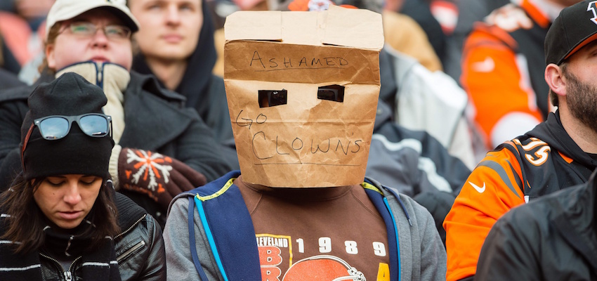
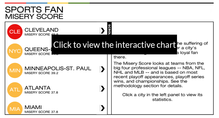
1. Cleveland (No change)

In last year’s misery rankings, we documented the many heartbreaking disasters in Cleveland’s painful sports history, from The Shot, to The Drive and The Fumble. (The pain of The Decision may have since melted away, however.) Since then, well, not much has changed. The Browns are still terrible. The Indians’ outlook is mixed, with some predicting a breakout season and others a bit more hesitant. And while the Cavaliers have LeBron (and Kevin and Kyrie), it’s tough to imagine the team winning a championship with the Warriors and Spurs looking on from the Western Conference, not to mention the Raptors nipping at their heels in the East.

It looks like Cleveland’s championship drought, which started way back in 1964, will haunt the city for a little while longer.

2. Queens and Long Island (Last year – 3rd)

All things considered, it was actually a pretty decent year for fans of New York’s less flashy, so-called “little-brother” teams, each with historical roots in Queens and Long Island. The Mets, led by an ace pitching staff that includes Jacob deGrom, Matt Harvey and Noah Syndergaard, stormed through the playoffs but were ultimately humbled by the Royals in the World Series. The New York Islanders, who are now based in Brooklyn but still have a passionate following in their original home on Long Island, are starting to look like a functional hockey organization again, though they haven’t won a playoffs series since 1993. The Jets, whose first home in Queens remains their cradle of support, have moved on from the tumultuous Rex Ryan era and are looking optimistically to the future. Last season’s winning record was a sign of potential things to come.

Ultimately, however, it’s all about championships. And the fans of New York’s oft-forgotten teams have now been waiting for 30 years, second in futility only to Cleveland among major sports towns.

3. Minneapolis-St. Paul (Last year – 5th)

Another ho-hum year for sports in the Twin Cities, and another year without a championship for these success-starved fans. Sure, the Minnesota Wild have figured out ways to squeak into the playoffs here and there, and sometimes even win a series. And the Vikings even occasionally dip their feet into postseason waters, only to quickly bow out. In basketball, despite the presence of an exciting young superstar like Andrew Wiggins and the return of prodigal son Kevin Garnett, the Timberwolves will be lucky to reach anything resembling success in the Western Conference within the decade. Believe it or not, the Twins won Minneapolis-St. Paul’s most recent championship…in 1991. Don’t expect them to win the next one.

4. Atlanta (Last year – 6th)

Atlanta is a newcomer to our top 5, and it’s another city in our list where the misery of sports fans comes not from wretched, basement-dwelling teams, but rather from the insidious feeling that a championship parade down Peachtree Street is unlikely to happen again for some time. The Falcons, year after year, are just so-so. Same with the Hawks. And the Braves, who last gave the city’s tomahawk-chopping fans a championship back in 1995, are probably the worst of the bunch.

5. Miami (Last year – 8th)

Miami probably represents our most controversial pick in this year’s rankings, but the math doesn’t lie, so bear with us as we explain. First, there are the city’s relatively less popular teams, the MLB’s Marlins and NHL’s Panthers. The Marlins haven’t made the playoffs since 2003, and they’re just bad. The Panthers haven’t won a playoff series in twenty years, and while this year they’ve managed to put together a solid playoff-worthy record, there is no expectation that 44-year old Jaromir Jagr will lead them anywhere near Lord Stanley’s Cup.

Looking next at the city’s more glamorous teams, we see further reason to worry: the Dolphins haven’t won a championship since the Nixon administration, and haven’t even been in the playoffs since 2008. And yes, the Miami Heat did win a championship a mere three years ago. We know that’s a big deal and should count for something. But consider that in the intervening years, LeBron James has taken his talents back out of South Beach, while the remaining members of the Big 3 (Dwyane Wade and Chris Bosh) are well into their 30s and are suffering from an alarming array of health problems. Sorry, Miami fans, but we think you’re going to be miserable for a while longer.

Which city do you think deserves to be in the top 5? Follow us on Facebook or Twitter and join the discussion.

Methodology Notes

Cities with Multiple Teams

Several large cities in North America have more than one professional team in the same league. To handle these cases, we divided fans up into natural allegiances, and calculated separate misery scores for each set of fans. Chicago is an easy one: one set of fans supports the Cubs (Chicago A), while the other supports the White Sox (Chicago B). Los Angeles is similar, with those supporting the Clippers (Los Angeles A) and those supporting the Lakers (Los Angeles B). Anaheim-based teams the Angels and the Ducks are not included due to geography, and since their fan bases are not as readily associated with the set of LA teams.

The San Francisco Bay Area has two football teams and two baseball teams (and a single basketball and hockey team). Those in the East Bay typically back the Raiders and Athletics (San Francisco Bay Area A), and those in SF and the peninsula back the 49ers and Giants (San Francisco Bay Area B).

Finally, there is the complexity of New York City. There are of course many exceptions to the clustering that we selected, but generally speaking, we have the “big brother” and “little brother” teams of New York. The Rangers and Knicks (who both play in Madison Square Gardens), along with the Yankees and Giants, have a somewhat consistent fan base. Similarly, the Jets and Mets (who shared Shea Stadium in Queens), along with the New York Islanders (who are originally from neighboring Long Island), tend to share fans based on geography and a common history (Queens-Long Island). We omitted from our analysis the New Jersey Devils, as well as the Brooklyn Nets (who may still be finding a consistent fan base after moving from New Jersey).

The Misery Score Explained

We first compute a misery score for each team, as follows: a team gets a demerit point for each year since (i) it last made the playoffs, (ii) it last won a playoff series (which doesn’t include MLB play-in game wins), and (iii) it last won a championship. We cap each of the three above point values at 30, because the average fan’s age in the major sports is approximately between 42 and 43, and the age of 12 or 13 is the general age of enlightenment when fans start to really understand sports (and the misery that comes with losing). These points are added together, which gives each team a number of points between 0 (if the team won a championship last season) and 90 (if the team hasn’t made the playoffs in the past 30 years); we then normalize these values onto the [0,100] scale, to get a team-level misery score.

Finally, for each city, we take a simple average of its component teams’ misery scores, to get an overall city-level misery score. For ease of interpretability, we bucket these city scores into 4 categories: green (0-15), yellow (15-30), orange (30-45) and red (45+). Green means that you only need to look back, on average, about 5 years to see a lot of success (Boston); yellow look back 10 years (Tampa Bay), orange look back 15 years (Washington, Philadelphia and Phoenix), and red over 15 years (Cleveland).

Note that we have only chosen to display NFL champions since the first Super Bowl (in 1967). Teams with their last win prior to that (ex. Detroit) are marked as “NA” in our graphic.

Don't miss our newest maps, charts and stories. Sign up now to have them delivered to your inbox.

A Heat Map of Public Transit Use in Toronto

As residents of Canada’s largest city know all too well, Toronto’s crowded public transit system is under a constant state of development, with grand plans to unify the system with new lines that crisscross the region. But before any of that can happen, Torontonians must get around using a sprawling patchwork of subway lines, streetcars, city buses, rapid transit lines, GO commuter trains, suburban Viva buses and airport express trains.

We wanted to take a high level view of the system by examining where residents in the Greater Toronto Area tend to rely on public transit the most. Using data from the 2011 National Household Survey, we sliced up the city into census tracts, and mapped what percentage of employed residents in each area use public transit as their main mode of transport to get between home and work.

Some obvious trends jump out immediately. Wealthy neighbourhoods tend to not use transit as much as others (see the Bridle Path in North York, for instance). On the other hand, areas clustered around major TTC stations tend to have very high usage – see the dark red regions near Finch Station, Eglinton Station, or along the Bloor and Danforth lines. In fact, the tract with the highest usage sits just east of Danforth and Victoria Park, with just over two thirds of residents using public transit to get to work. Similarly, some of the isolated, distant areas with high usage tend to be clustered around GO Train stations, like Tom O’Shanter in the northeast, Mimico in the southwest, and Rouge Hill in the east.

But there are some surprises, too. Some tracts with incredibly high public transit usage rates are nowhere near any rail line, be it metro or commuter. Residents along the notoriously crowded 36 Finch bus line — which passes through dark red areas near Bathurst and Finch, and Jane and Finch — or the 32 Eglinton bus, have long been at the mercy of the city’s glacial pace of transit progress.

Methodology

Statistics Canada collects public transit usage data for employed residents over the age of 15. Public transit must be a resident’s main mode of transport to travel between home and work to count, as opposed to walking, cycling, driving, etc. Census tracts represent the most granular slicing of a city that Statistics Canada looks at, and typically represents an area with between 2,500 and 8,000 residents.

Don’t miss our newest stories! Follow The 10 and 3 on Facebook or Twitter for the latest made-in-Canada maps and visualizations.

Don't miss our newest maps, charts and stories. Sign up now to have them delivered to your inbox.

Tap Water

Turned Off by the Tap: Do Canadians Trust Their Water?

As the water contamination crisis in Flint, Michigan has exploded over the past year, residents of cities across North America have increasingly wondered about the safety of their own municipal tap water. In some places in Canada, they have good reason. Worries about Flint-like lead contamination have authorities redoubling efforts to examine aging water infrastructure. Memories of the disastrous Walkerton E. coli crisis in 2000 are still fresh in people’s minds, and to this day, there are roughly 1000 active boil-water advisories at any given time across the country. Combine that with persistent (though scientifically unsupported) concerns about the health effects of fluoridation, and it becomes clear why Canadians in some parts of the country choose water from the bottle rather than the tap.

The data shows that while approximately two thirds of Canadians use tap water as their primary source of drinking water, in some major cities almost half of residents avoid tap water for their primary drinking needs. Though the country’s municipal water systems are generally considered of high quality overall, the numbers suggest that in many communities there is a deep distrust in the safety of drinking water.

How many Canadians drink tap water?

When the Water Turns Brown

When brown water started emerging from taps in Winnipeg in 2010, residents of Manitoba’s capital were understandably alarmed. The city ordered an investigation to determine the cause of the discolouration, but brown water persisted in some areas throughout the city for the next several years, and spiked in the summer of 2013. The city finally determined that high levels of manganese, a potential neurotoxin at high concentrations, may be to blame. But guidance from city hall on the safety of the drinking water has nevertheless been confusing. On one hand, the city appears to be playing down any serious health risks, noting that “discoloured water can result from routine operations,” and appears to suggest that the main reason residents should avoid using discoloured water is because it “does not taste, smell or look pleasant, and it can stain clothes.” On the other hand, the Winnipeg Regional Health Authority is much less equivocal, advising residents unambiguously to avoid drinking the brown water or using it for food preparation.

Reports of brown water from frustrated Winnipeggers have periodically continued through 2015, which helps explain why Winnipeg’s rate of tap water consumption (54%) is among the lowest in Canada.

Boil-Water Orders Across the Country

Ottawa and Gatineau may together form the core of the National Capital Region, but they may as well be in different countries when it comes to drinking tap water. While Ottawa’s tap water is generally considered of very high quality, Gatineau, which has a separate municipal water system from its neighbour, has been plagued with numerous boil-water advisories over the past years, leading to far fewer of its residents (62%) relying on tap water.

In many parts of the country – including a disproportionate number of First Nations communities — boil-water advisories are simply a fact of life. Saint John, New Brunswick, the second largest city in the Maritimes, has been plagued by boil-water advisories for years. Recently, part of the city’s water supply has been transitioned from lake water to well water, an advance which the city promises will bring better tasting, better smelling, and most importantly, safer water to residents. With only 54% of Saint John residents relying on the tap for their source of water, it remains to be seen whether these changes will increase trust in the municipal water system.

Lead Pipes

The crisis in Flint has led many in Canada to wonder whether old lead pipes may be lurking in our aging water infrastructure. In 2007, Ontario ordered an inspection of old homes across the province for potential lead contamination after surprisingly high levels were discovered in London. As reports started coming back that some homes in Sarnia, Hamilton and Owen Sound measured lead levels above the provincial standard, cities and towns across the province instituted rigorous inspection procedures – particularly in older homes – to discover and correct problems early. Nevertheless, with lingering concerns about lead and the Walkerton E. coli crisis still a recent memory, a meager proportion of residents in many of Ontario’s smaller cities like Kitchener-Waterloo (55%), St. Catharines (55%) and Peterborough (58%) appear ready to fully embrace tap water as their primary source of drinking water.

Methodology

Drinking water habits were gathered from Statistics Canada’s 2013 Households and the Environment Survey. In this piece, we use the figures which indicate what percentage of residents use tap water as their primary source of drinking water. The survey also provides data for the percentage of people who rely on bottled water, a combination of tap and bottled water, or other sources, as their primary source for drinking water. We note that data for the combination of tap and bottled water case was often deemed unreliable by Statistics Canada, which is why we focused on tap water only.

Don’t miss our newest stories! Follow The 10 and 3 on Facebook or Twitter for the latest made-in-Canada maps and visualizations.

Don't miss our newest maps, charts and stories. Sign up now to have them delivered to your inbox.

Forget the Critics: The Best Canadian Movies of All Time By the Numbers

Canada has always had a bit of a complicated relationship with the film industry. After all, it’s tough when so many of our biggest talents flee south to Hollywood at the first inkling of success. The exodus began with Hollywood starlets like Mary Pickford and Norma Shearer in the 1920s, and has continued unabated ever since, with some of today’s most bankable stars like Rachel McAdams, Ryan Gosling and Jim Carrey, and directors like James Cameron, Paul Haggis and Brad Peyton, making their way down to Los Angeles for good. Canadians have tended to look on with delight at the achievements of their countrymen, but also with a wounded pride that these talented folks had to leave in the first place.

But beyond that great migration south, the Canadian film industry — comprising movies produced in Canada and made primarily by Canadians — is remarkably strong, and in many ways, has never been stronger. There are the great Canadian auteurs like David Cronenberg, Atom Egoyan and Denys Arcand, wildly talented youngsters like Xavier Dolan and Sarah Polley, and weird and wonderful masters like Guy Maddin that we are proud to call our own.

We set out to identify the best Canadian movies ever made. But rather than seeking out the opinions of pundits and professional critics, we wanted to see what Canadian movies people actually love to watch. So we looked to IMDB, which collects movie ratings from regular people – anyone can create an account on the site and submit their ratings – as our golden data source. Now remember, a high rating on IMDB means that it’s a film that moviegoers love, and not necessarily that the film is a pinnacle of the craft, though it bears noting that these often coincide.

Canadian Film Rankings

You might be asking, at this point, what exactly constitutes a Canadian movie, anyway? Does it matter if the director is Canadian? Or the stars, or the writers, or the cinematographer? Does the film have to be shot in Canada? We decided not to wade through these sticky questions, and instead deferred to the Academy of Canadian Cinema and Television which runs the Genie Awards (the Canadian version of the Oscars), now called the Canadian Screen Awards. If a feature-length movie was nominated for some category in the Canadian Academy’s awards since their inception in 1949, we included it in our list. Finally, to make sure that little-seen movies with a few high ratings don’t pollute our rankings, we employed a similar procedure to IMDB called Bayesian ratings in order to generate more accurate “adjusted” ratings. See the Methodology section for details.

What is most striking about this ranking – and how it contrasts with typical critics’ lists like those released by the Toronto International Film Festival – is just how much everyday viewers are drawn toward Canada’s newest generation of films produced over the last 15 years. Importantly, we know this isn’t simply some “newness” bias inherent in IMDB’s rating system or audience, as the site’s list of the Top 250 films of all time skews much more aggressively toward classic fare.

The young 20-something bad boy of Montreal cinema Xavier Dolan, who most recently directed Adele’s Hello music video, is represented a remarkable three times in the top 50 (Mommy, Laurence Anyways, I Killed My Mother), and continues to light up Hollywood with a pipeline of ambitious, innovative projects. Several of his contemporary Quebecois filmmakers are no less talented: Denis Villeneuve, whose masterful mystery Incendies comes in as the second most favourite Canadidan film, has been tapped to helm the Blade Runner sequel (sadly, an American production), while Jean-Marc Valleé, who is now perhaps most famous for directing The Dallas Buyer’s Club and Wild, pitches in two films to the top 50, the family-driven dramas C.R.A.Z.Y and Café de Flore.  

But perhaps nothing says that Canadian cinema has really made it better than the one-two punch of Room – which tops the list for viewers’ all time favourite Canadian film – and Brooklyn. Both movies are Irish-Canadian co-productions, and remarkably, both sleeper hits are nominated for Best Picture in the 2016 Academy Awards. While neither film features a Canadian director, both casts feature strong Canadian content, including the remarkable young star of Room, Vancouverite Jacob Tremblay.

But lest you think viewers care only about what’s new and hot, we are happy to report that people do still love the classics. A Christmas Story, that definitive American holiday film which, confusingly, is also technically a Canadian film (it was shot in various locations throughout Ontario and received the Genie Award for Best Direction in 1985), clocks in as the third most loved movie. Important keystones in Canadian culture like Les Ordres – which tells the story of the 1970 October crisis – and Mon Oncle Antoine – considered one of the masterworks of 20th century Canadian filmmaking – join other classic films on the list like Egoyan’s The Sweet Hereafter, Arcand’s Jesus of Montreal, and Mankiewicz’s Les Bons Débarras.

Finally, a quick nod to those films that didn’t quite make the top 50. Raunch comedies Meatballs and Porky’s may be branded upon the brains of Generation Xers, but their IMDB ratings are simply not high enough to make the cut. Same goes for you Cronenberg fans out there; while Eastern Promises cracks the top 10, cult favourites like Videodrome, Dead Ringers, eXistenZ and Scanners don’t quite have the fan support and crash out of contention. Some other notable films that you might be missing: Exotica, Being Julia and The Decline of the American Empire.

Methodology

IMDB data was gathered at the end of January 2016 for each feature-length film nominated for a Genie Award, beginning in 1949 – when they were called the Canadian Film Awards – through 2016 – where they are now referred to as the Canadian Screen Awards.

The adjusted ratings were computed according to the following standard Bayes’ rating formula, which is also employed by IMDB when constructing their top lists:

adjusted rating = (v/(v+m))R+(m/(v+m))C,   where

  • R = average IMDB rating for the film
  • v= the number of IMDB ratings that the film received
  • m = parameter that effectively downweights films with very few ratings (in our case m = 1000)
  • C = average rating across all films in our ranking.

The purpose of the adjusted ratings is to make sure that highly rated but little-seen films don’t get an inflated ranking. This is why, for instance, a film like Les Ordres with an IMDB rating of 8.3 does not appear higher. It has fewer than 800 ratings on IMDB, while a film like Eastern Promises – which ranks ahead but only has an IMDB rating of 7.7 – has over 180K votes. We are much more confident in the rating of the latter than of the former.

A final note about what sorts of films the IMDB ratings tend to favour: the ratings reflect viewers’ preferences for films, and not those of critics. However, these are often not mutually exclusive concepts. For instance, a quick glance at IMDB’s top 250 reveals accessible masterpieces like The Godfather and Raging Bull intermingling with pure fan favourites like Die Hard and The Dark Knight.

Don’t miss our newest stories! Follow The 10 and 3 on Facebook or Twitter for the latest news and analysis.

Don't miss our newest maps, charts and stories. Sign up now to have them delivered to your inbox.

People waiting in line at an airport

Stuck at the Gate: Which Canadian Airlines Will Get You There On Time?

It’s no secret that flying in Canada has become an increasingly aggravating experience. With long security lines, cramped seats, the disappearing value of loyalty points, and bloated fees for everything from the first checked bag to a seat in the spacious emergency row, it’s hard not to dread that upcoming flight.

But at least you can count on your airline getting you there on time, right? Well, not so fast. On-time performance of Canadian airlines has long been a problem, and there’s no sign it’s getting any better. Back in 2012, national carrier Air Canada’s on-time rate across all of its flights, both domestic and international, was a dismal 61%, among the absolute worst in the industry across all major international carriers (where “on time” means that the flight arrived at the gate within 15 minutes of its scheduled time). Compare that to leader Japan Airlines’ 90% on-time rate and you can see why Canadian travelers are so jealous of their international counterparts. And while weather is certainly a major factor when traveling in and out of Canada — causing about half of all delayed arrivals — much of the rest is due to issues very much within an airline’s control, like mechanical problems or scheduling and crew mix-ups.

To see how bad life really is for the Canadian flier, we dug into the numbers to see not only how Canadian airlines stack up against one another, but also which airports and routes in this country have the worst on-time performance. We compiled six months of data from FlightStats covering flights along Canada’s major domestic routes, which join nine of the busiest airports in the country (Toronto Pearson, Vancouver, Calgary, Montreal, Edmonton, Ottawa, Winnipeg, Halifax and Quebec City).

The Airlines

Sunwing Airlines has by far the worst on-time performance for flights along these major domestic routes, at an absolutely miserable 63.1%. No other carrier is even close. The discount airline is known primarily for its leisure trips down to sunny destinations in Mexico and the Caribbean, but it operated nearly 500 flights within Canada in the second half of 2015 as well. When you look at the popular Toronto to Vancouver route, which is dominated by heavyweights Air Canada and Westjet, it seems like Sunwing just isn’t even trying, achieving a laughable 32% on-time rate, with an average delay on those flights of 52 minutes! And just in case you’re wondering whether it was just the wintry holidays hitting Sunwing particularly hard, the airline had just a 64% on-time rate even when you exclude the last two months of the year.

Canadian Airline On Time Percentage

On the other hand, Air Inuit, a regional carrier that primarily serves small destinations in Nunavut and northern Quebec, had the best on-time performance for the major airports that we considered, at 90.8%, but these flights cover only the Montreal to Quebec City route (Air Inuit’s only major route). The best medium-to-large sized airline was Westjet Encore at 88.7% on-time. Though Westjet Encore is considered a regional airline and a subsidiary of the much larger Westjet, it regularly flies a wide variety of routes (Edmonton to Calgary, Montreal to Toronto, Halifax to Ottawa), and will start dipping its toes outside of Canada for the first time in March, flying to Boston.

And how about the big boys, Westjet and Air Canada? Westjet comes out on top for flights between these major Canadian airports, arriving on time a respectable 86.0% of the time compared to Air Canada’s 83.3% (note that we’re not considering these airlines’ on-time rates for international destinations here). Westjet emphatically outperforms Air Canada on long cross-country trips like Montreal to Vancouver or Calgary to Toronto, although Westjet’s on-time edge mostly evaporates on short haul trips like Toronto to Montreal.

The Airports

Not surprisingly, Canada’s busiest airport also tends to have the worst on-time performance. Flights in and out of YYZ to other major Canadian destinations arrived on time just 81.5% of the time, with an average delay of 18 minutes. The worst performing route in and out of Toronto? Flying from YYZ to YYC (Calgary) is particularly painful. Both Westjet and Air Canada serve that busy corridor, and with almost 4000 flights between them in the second half of 2015, just 71% arrived in Calgary on time. On the other hand, hopping a flight to YOW (Ottawa) from Toronto is a relative breeze, arriving on time for over 88% of the trips.

On the other hand, fliers in Edmonton have it pretty good, with an overall on-time rate of 88.1% in and out of YEG along the major routes. Take your pick of destinations: Halifax, Ottawa, Vancouver. You’ll get there on time over 90% of the time to these cities (and it’s not too bad going anywhere else, too). And as we discovered in our traffic study last year, since Edmonton’s traffic is actually quite mild for a city of its size, Canadian transportation officials should be looking at The Big E for some inspiration.

Methdology

The dataset includes every commercial flight by a Canadian airline over the six-month period from July to December 2015, between the following nine major Canadian airports: Toronto (YYZ), Vancouver (YYV), Calgary (YYC), Montreal (YUL), Edmonton (YEG), Ottawa (YOW), Winnipeg (YWG), Halifax (YHZ) and Quebec City (YQB). A flight is considered “on time” if it arrives within 15 minutes of its scheduled arrival time.

Don’t miss our newest graphics, maps and stories about Canada! Follow The 10 and 3 on Facebook or Twitter for the latest news and analysis.

Don't miss our newest maps, charts and stories. Sign up now to have them delivered to your inbox.

401 Traffic Jam

How Bad is the Traffic Where You Live?

Traffic is bad and getting worse in cities across Canada. A recent study study suggested that the average Canadian commuter lost a mind-boggling 79 hours to traffic in 2014, an increase of two hours from the previous year.

But not every commute is created equal. While drivers traveling across Edmonton or Winnipeg may face some unpleasant congestion during busier times, their pain pales in comparison to the horror of the country’s most daunting commutes. Drivers heading to downtown Toronto along the overburdened Don Valley Parkway from the dense northern suburbs have learned to face the daily 14km parking lot that snakes through the megacity; Vancouver commuters on their way to the downtown core from southern suburbs like Surrey stare down monstrous bottlenecks every day at river crossings like the Pattullo Bridge.

Canada Traffic Map

We set out to measure just how bad traffic can get in Canadian cities by examining the worst case scenarios for common driving routes (other studies have looked at numbers like hours lost in traffic per year). In particular, we considered a variety of routes in each major Canadian city — point-to-point trips across town, commutes from the suburbs to downtown, and a trip from the airport to the city’s central transit hub — and compared (using the Google Maps traffic planning tool) how long the worst-case trip takes versus a no-traffic free flowing trip. We define the worst-case trip as the highest amount of time predicted at the top of Google Maps’ prediction range over the course of an entire week.

We call this ratio between the worst-case trip and the free-flow trip the traffic stretch multiplier for that route, and calculate a city’s overall traffic stretch by averaging across the different types of routes. Where the traffic stretch is relatively low — in smaller cities like St. John’s or Saskatoon, for example — it’s enough for drivers to give themselves just a few extra minutes leeway when planning their trip. But where the traffic stretch is highest — in a monster-traffic city like Toronto and to a lesser extent in Montreal and Vancouver — drivers must plan for plenty of extra time in case traffic quickly turns sour. See the methodology section for more details on our calculations.

The Ranking

Traffic Stretch Multiplier Table

Toronto

Toronto experiences by far the largest traffic stretch of any Canadian city, with the typical route taking up to 2.8 times longer in the worst case than the free-flow trip. The problem, as Torontonians know too well, is with the city’s ill-equipped expressways and highways. While a trip downtown from dense residential areas like Markham in the north or Scarborough in the northeast could take under a half hour in free-flow traffic, commuters in peak traffic can expect a voyage of well over 75 minutes. The Gardiner Expressway, the hulking elevated roadway cutting off the city from its Lake Ontario harbour, is the bane of many a Toronto driver; an otherwise leisurely 18-minute ride from the Beach in the east to High Park in the west could take 45 minutes or more at the worst times. And forget getting down to Union Station from Pearson airport in a reasonable amount of time; major backups on the Gardiner and Highway 427 can give this route a stretch multiplier of 3X or more (although the much heralded and speedy Union Pearson Express train which links these two hubs remains woefully underused).

Montreal and Vancouver

While the country’s second and third largest cities – Vancouver and Montreal – don’t hold a candle to Toronto when it comes to traffic stretch, they have alternately taken the crown for worst traffic in Canada in various past studies. And our analysis still finds plenty of evidence to suggest that being a driver there can be a miserable experience. Montreal, where the typical route can take 2.3 times longer at the worst time compared to free-flow traffic, has severe congestion both on the island (think the north-south Décarie) as well as on bridges leading to the city from off-island (like the toll Champlain Bridge from Brossard, the busiest single span bridge in the country).

Like Montreal, Vancouver’s traffic woes are exacerbated by the bodies of water that surround it. With a traffic stretch of 2.0, Vancouver is hamstrung by the network of congested river crossings to its north, east and south. The new tolled Port Mann Bridge actually provides a quick crossing for Surrey commuters, but is vastly underused, as drivers opt instead for free bridges like the overcrowded Pattullo Bridge. To the north of the city, the Second Narrows Bridge is getting worse and worse for commuters, as the region experiences a boom in employment as well as population growth.

The Relative Lightweights

Much of the rest of Canada faces far less severe traffic stretch than the big three of Toronto, Montreal and Vancouver. And perhaps this is not much of a surprise: with only Ottawa, Calgary and Edmonton (just barely) exceeding the 1 million population threshold, Canada’s urban roadways have so far been able to handle traffic volume rather well.

But some cities are starting to notice the unpleasant congestion that creeps in when a population is starting to overgrow its aging infrastructure. Calgary’s Deerfoot Trail is already developing a reputation for nasty rush hour traffic — a commute downtown from a southeastern suburb like MacKenzie Town that used to take only 20 minutes a decade ago in free-flow traffic can now run almost 50 minutes in the worst case; Ottawa’s Queensway, along a route leading downtown from suburban communities like Barrhaven or Stittsville, can produce traffic stretch multipliers of 2 or more in the worst case.

Methodology

We examined the 9 largest metro areas in the country by population, and added five smaller cities for geographic diversity (Halifax, Victoria, Saskatoon, Regina and St. John’s). For each city, with the help of local experts, we compiled three types of routes:

  • one route from the city’s main airport to the city’s main transit hub (or equivalent central hub). Ex. YYZ -> Union Station in Toronto, YUL -> Gate Centrale in Montreal, YWG->Portage and Main in Winnipeg.
  • a set of routes from suburban residential areas to downtown commuter destinations. Ex: Coral Springs -> Olympic Plaza in Calgary, Barrhaven -> Rideau Centre in Ottawa, Sherwood Park -> City Hall in Edmonton.
  • a set of point-to-point routes between popular destinations within the city. Ex: UBC -> Hillcrest Centre in Vancouver, Beacon Hill Park -> Mount Douglas Park in Victoria, Churchill Square -> Signal Hill in St. John’s.

For each route, we used the route prediction tool on Google Maps to find the free-flow time and the worst-case time along that route. The free-flow time is defined as the shortest time required to traverse that route (which usually occurs in the middle of the night); for the worst-case time, we looked at the top of Google’s prediction range, and defined the worst-case time as the highest value of this top prediction value over the course of an entire week. We can then compute a traffic stretch multiplier for each route by taking the ratio of the worst case to the free-flow case, and a traffic stretch multiplier for each type of route by averaging across those routes. The city’s overall traffic stretch multiplier is the average traffic stretch multiplier across the three types of routes.

Route data was collected in early October. We note that Google’s traffic prediction model is constantly being updated (though none of the routes change too drastically), so values may have changed slightly since the data was collected.

Don’t miss our newest stories! Follow The 10 and 3 on Facebook or Twitter (@the10and3) for the latest news and analysis.

Don't miss our newest maps, charts and stories. Sign up now to have them delivered to your inbox.

TTC Subway Car

Toronto’s Subway Fares Are Going Up (But So Are Fares in Every Other City in the World)

The Toronto Transit Commission (TTC) recently announced that cash fares for a subway or bus trip are rising in 2016 by a quarter to $3.25 (token fares are rising by a dime to $2.90). Certainly, Toronto residents have some reason to complain; Toronto’s transit costs are among the highest in North America, on par with the pricey transit systems in cities like Ottawa, Calgary and Miami. One of the driving factors for Toronto’s sky-high prices is that the city provides the lowest per-passenger subsidy on the continent (just $0.88), meaning that riders must pick up more of the tab for each of their trips.

Subway/Metro Price Increase Over Time (Cash Fares, Base Year = 2000)

However, it is short-sighted to focus on incremental fare increases when every transit system in the world is raising prices to manage their increasing costs. Consider that there will have been five fare hikes on the TTC since the year 2000, with cash fares rising 62.5% over that period (from $2 to $3.25). But that is actually on par or even lower than cash fare increases for comparable cities in Canada or around the world. Subway systems in Montreal (62.5%) and Vancouver (57%) experienced nearly identical fare increases over the past 15 years, while passengers in New York City (83.3%) and London (123%) have been forced to shell out much more in the past decade and a half just to get around town. Metro fares continue to steadily march upwards around the world, from Boston to Rio de Janeiro to Berlin, due to an increasingly expensive mix of energy, infrastructure and labour.

In protesting the upcoming fare increase, Toronto City Councillor Glenn de Baeremaeker suggested that “every year we go back to our customers and add a nickel or add a dime. That is the death of a thousand cuts; eventually people will say [they’re] just going to go out and buy a car.” The councillor is barking up the wrong tree. Fares that rise in order to keep up with increasing operational costs are necessary to keep the system running and pay the bills, and Toronto has managed to keep this kind of fare growth quite modest relative to comparable cities in Canada and around the world. To keep transit affordable, tackle the elephant in the room — subsidies — and don’t be distracted by the periodic fare hikes.

Data Sources and Methodology

For consistency, we looked at the cost of a single ride cash fare in each city. Many transit systems do offer various tokens, cards or passes that can give a discount below the cash fare.

Don’t miss our newest stories! Follow The 10 and 3 on Facebook or Twitter (@the10and3) for the latest news and analysis.

Don't miss our newest maps, charts and stories. Sign up now to have them delivered to your inbox.

Uber App

How Much Do You Save by Using Uber?

People use Uber because it’s convenient, easy and considered less expensive than traditional taxis. But how much cheaper is UberX — the company’s low-cost option — than a cab in Canadian cities? As it turns out, it depends a lot on which city you live in. Ever since Uber arrived in Toronto in 2012, the company has expanded rapidly, now operating in ten Canadian cities, the newest of which is Calgary, which is enjoying its first month of service. The company accumulated its share of controversy over the past three years, as taxi companies, which must offer metered fares set at the municipal level, are struggling to compete with a business model that many see as a cheaper, faster, and more pleasant way to get a ride across town quickly.

Uber Prices in Canada

In most Canadian cities with UberX, our study shows that the company charges between 30% and 50% less than what a taxi would charge for the identical route. Toronto, Ottawa and Montreal see the largest gain in picking Uber over a taxi, where customers save 50%, 44% and 41% of what their average taxi fare would be, respectively. On the other end, Quebec City (24%) and Hamilton (29%) see the smallest savings compared to the equivalent cab fare. Short routes around the city tend to offer slightly smaller savings than longer routes. This is due to the different pricing structure of the two services; whereas taxis typically charge a sizable per-distance rate plus a small per-minute rate when in stopped or slow traffic, Uber typically charges a smaller per-distance rate plus a standard per-minute rate (regardless of speed). As a consequence, longer high-speed routes (for example, along the highway to the airport) are even more cost effective on Uber.

Average UberX Savings in Canada

What allows Uber to offer such deep discounts in some Canadian cities while providing more modest savings in others? One theory is that taxi prices may be so exorbitantly high in places like Toronto, Ottawa and Montreal, that Uber can easily afford to undercut taxi rates by 40-50% without breaking a sweat. Indeed, the data appears to bear this out: Toronto’s taxi rates are among the highest in the world (even after the recent $1 reduction in base fare), followed closely by — you guessed it — Ottawa and Montreal. Another theory is that Uber is strategically selecting large markets in which they aggressively pursue market share by offering rock-bottom prices; the company has been known to dip into its deep coffers to keep drivers on the road (for example, by paying their tickets). In Toronto, at least, the company appears to have succeeded in building an impressive market share.

Uber isn’t always the best choice over a cab, however, especially when taking it during its surge pricing. In order to encourage more Uber drivers to take to the streets during high demand times, like when a Blue Jays or Canadiens game lets out or when public transit shuts down, fare prices can rise substantially. Each city has a unique point at which Uber fares need to rise before it becomes cheaper to hail a cab – in Toronto and Ottawa, it is roughly when fares are doubled, but in other Canadian cities it can be slightly less. As a rule of thumb, when surge prices pass the 2x mark, begin looking for a cab; unlike Uber, taxi rates remain the same, regardless of how busy they might be. However, increased demand usually comes about when everybody is hunting for rides, so tracking down that open taxi might be easier said than done. It’s uncommon for surge prices to rise significantly without a lack of free cabs in the area. As a result, many Uber users choose to bite the bullet and pay the extra fare instead of trying to hail an elusive cab.

Methodology

The 10 and 3 examined nine of the ten Canadian Uber markets. Halifax was omitted because the service does not have a reliable presence in the city, and does not (nominally) operate beyond a modest area within the municipality. For each city, four routes were collected, originating at the central PLVI intersection (for instance, King and Bay in Toronto); three of the routes ended at important travel points within the city (ex. the West Edmonton Mall, High Park in Toronto, or Universite Laval in Quebec), while the fourth went to the major regional airport. The Uber vs taxi savings were averaged across these four routes to get a city’s overall average discount.

Cost for UberX and taxis for these routes were collected from TaxiFareFinder and Uber’s own fare estimates and pricing structure guidance. Costs are computed with the assumption of zero-to-low traffic levels. Taxi costs include a customary 15% tip whereas our UberX costs do not include an added tip (it is not possible to tip within the app and gratuity is generally considered part of the fare).

Don’t miss our newest stories! Follow The 10 and 3 on Facebook or Twitter (@the10and3) for the latest news and analysis.

Don't miss our newest maps, charts and stories. Sign up now to have them delivered to your inbox.

2011 Census

Here’s Why the Return of the Mandatory Long Form Census Matters

By now, you’ve heard that Canada’s long form “mandatory” census is on its way back. It was replaced in the 2011 census year with the voluntary National Household Survey (NHS), with Prime Minister Stephen Harper arguing the importance of allowing citizens to opt out of intrusive government data collection. This decision was roundly criticized by scientists and researchers at the time, and perhaps surprisingly, this relatively esoteric issue of statistics and data accuracy became something of a campaign issue in the lead-up to this year’s election.

But beyond the bluster and politics of this issue (and, to be sure, there was a lot of politics around the census), here’s a quick primer on why the return of the long form census matters.

It costs less for the same amount of data

Some on the Conservative side were surprised to learn that the voluntary NHS cost $22M more than the long form census. How can that be? StatsCan typically sends out the long form census to about 1 in 5 households, and in 2006 achieved a response rate of 93.5%. In anticipation of a lower response rate to the NHS, StatsCan was forced to send out the survey to substantially more households — about 1 in 3, or 4.5 million total households. That costs a lot more money. In fact, more Canadian households responded to the NHS than initially anticipated, but not by much, as the rate still came in at a modest 68.6%.

Could StatsCan have saved that $22M by sending out the NHS to fewer households? Sure. But as we describe below, the data quality from the NHS was already bad, so it would only get commensurately worse.

A huge chunk of the country doesn’t even exist, according to the NHS

The census aggregates data according to a hierarchical level of regions, starting at the country and provincial levels. The country is then further divided up into so-called census divisions (which correspond to large cities, regions or counties, which we use in our language map, for example), even smaller census subdivisions (corresponding to municipalities), and sometimes even further down into census tracts (which may have just a few thousand residents).

As Maclean’s pointed out earlier this year, the small town (and census subdivision) of Melville, Saskatchewan has, for all intents and purposes, ceased to exist as a part of Canada. We know almost nothing about it, aside from a guess as to how many residents call it home. If a census subdivision had a response rate less than 50% for the NHS, StatsCan simply did not publish data about it, because the data was essentially meaningless. As a result, about a quarter of Canada’s 4,556 census subdivisions don’t exist in the way Melville doesn’t exist. Manitoba was hit especially hard by this 50% threshold; about a third of its rural communities are now dead zones on the map. No understanding of the languages spoken there, no insight into the aboriginal or immigrant population, no sense of the way folks get around, how or where they work, and how old they are.

As a side note, this is why our language map of Canada uses such a coarse division of the country. Creating a map with finer detail — say, dividing up cities like Toronto or Montreal into slightly less massive chunks of humanity — would have required using census subdivisions, which are simply unreliable when looking across the country.

Even where we have enough data, it’s probably not reliable

The statistical reason why it matters that a census is mandatory rather than voluntary is called sample bias. When the data you get from a survey, or poll, is somehow not representative of the population as a whole, then your conclusions are simply not accurate. What’s amazing in statistics is that you don’t actually need to ask everyone in the country to get an accurate picture — you can ask quite a small percentage, in fact — but you do need to ask a representative sample.

This is a big problem. Western Canada has been plagued by a spate of polling disasters in several recent elections due to sample bias, while the results of many recent high-profile academic studies have been called into question by this same issue.

The voluntary NHS is no different, but at least we knew beforehand that there would be a problem. StatsCan knows that certain groups are more or less likely to fill out a voluntary survey than others. Their own estimates suggests that the Filipino-Canadian population, for example, has been overcounted by a whopping 7.3%, while the black-Canadian population has been undercounted by more than 3%. Our immigrant map — which shows an impressive but surprising wave of Filipino-born Canadians in the Prairies and the territories — is perhaps just one victim of data inaccuracy.

We have enough trouble getting people to respond to the “mandatory” form

The mandatory form had a response rate of 93.5% in 2006, which is high, but not as high as the short form census, which was answered by 96.5% of all Canadian households that year. That’s a three percentage point gap of households who presumably found the long form questionnaire so intrusive as to risk potential consequences. Indeed, there has been a nominal penalty of $500 or three months in prison for not filling it out, but messaging on this from the new Liberal government as to whether the penalty may apply next year has been ambiguous. Moreover, a decade of opposition to the census from up high has girded many who may otherwise pause when filling out such a form to put up even more resistance. Expect low response rates to continue next year — if rates dip below 90%, we may not be out of the woods when it comes to poor data quality for another census cycle or two.

Don’t miss our newest stories! Follow The 10 and 3 on Facebook or Twitter for the latest news and analysis.

Don't miss our newest maps, charts and stories. Sign up now to have them delivered to your inbox.

Canadian House Of Commons

Follow The Data:
Election Edition

Follow The Data is our weekly curated list of cool and unusual data stories from around the country and the world. Got a hot tip on a data story? Let us know on Facebook or Twitter.

Some election analysis to begin this week’s roundup:

Slicing and Dicing the New Parliament

Interactive visualization showing the vitals of the new House of Commons. [Maclean’s]

First Past the Post vs Proportional Representation

What would the new House of Commons look like if Canada used proportional representation rather than a first-past-the-post voting system? [National Post]

Visualizing the Changing House of Commons

A series of simple data visualizations show how control of seats flowed between parties as a result of the election. [Toronto Star]

Google Searches Predict Election Better than Polls Do

Leading up to election day, search interest in the party leaders closely mimicked final election results, and appeared to outperform most polls. [Huffington Post Canada]

Other data stories that caught our eye:

Colour coding TO’s buildings

Mesmerizing map colour codes Toronto’s buildings by height. Easy to spot: Queen’s Park. A little trickier: the Quantum Towers in midtown. [BlogTO]

Don’t Trust Fandango’s Ratings

Fandango’s movie ratings appear artificially inflated across-the-board due to some pretty basic rounding errors in their algorithms. No, Avengers: Age of Ultron was not that good! [Five Thirty Eight]

The best (and worst) places to live in Toronto

A fun map and ranking of the best neighbourhoods in Toronto, based on factors like crime, shopping, entertainment and schools. Yonge & Eglinton (#1) and Casa Loma (#2) top the list. Proximity to subways and castles is very important, apparently. [Toronto Life]

Don’t miss our newest stories! Follow The 10 and 3 on Facebook or Twitter for the latest news and analysis.

Don't miss our newest maps, charts and stories. Sign up now to have them delivered to your inbox.

Police Line Do Not Cross

Which Canadians are Most Likely to be the Victims of Hate Crimes?

In the run-up to the federal election in Canada, the niqab issue — whether a woman should be required to remove the face-covering garment when swearing the citizenship oath — has taken centre stage. Along with an alarming flurry of alleged hate crimes committed against Muslims in the past few months, there have been claims of a rising tide of Islamophobia in the country. But when accounting for population, a closer look at the numbers suggests a rather different narrative: despite the real and worrisome rise in hate crimes toward Muslims, two other minority groups are far more likely — by an order of magnitude — to be the victim of a hate crime.

Jewish Canadians, remarkably, are more than 10 times as likely to be the victim of a hate crime than Muslim Canadians, while black Canadians are more than 14 times as likely to be victimized than the average Canadian (and three times as likely as the next highest race or ethnicity tracked by StatsCan). By any reasonable reading of the data, these are profoundly concerning figures.

What is a hate crime?

StatsCan, which collects hate crime data from the country’s police services, defines a hate crime as “a criminal offence committed against a person or property, where there is evidence that the offence was motivated by hate” based on race, ethnicity, religion, gender, sexual orientation or other protected classes. These crimes come in a variety of forms, with approximately 60% of reported hate crimes in Canada being non-violent crimes such as mischief or public incitement of hatred, while the remaining hate crimes are violent, which include offenses like assault, uttering threats, and criminal harassment.

The numbers

We looked at the number of hate crimes reported over the three-year period 2011-2013 (the most recent data available), and calculated how likely it is that people of various groups will be victimized. This per capita approach helps understand the dangers that any individual in a particular group may face.

Looking across all Canadians, there were a modest 6.0 hate crime incidents per 100K people over this three-year period. This rate is low enough that most folks will fortunately never experience a crime of this kind, and is approximately the probability of being struck by lightning over a lifetime. But what about particular religious minorities? Muslim Canadians, for instance, suffered 15.1 incidents per 100K people in this time period. This jump indeed seems rather worrisome, particularly in the context of the niqab debate and the recent spate of incidents, until you consider that Jewish Canadians were the victims of 185.4 incidents per 100K people. That’s more than 12x higher, and makes Jewish Canadians far and away the most targeted minority religious group in Canada per capita. When restricting only to violent offenses, the ratio is still high, but narrows somewhat to a factor 6x higher.

B’nai Brith Canada, which tracks antisemitic incidents in the country, sees no letdown in the pace of such crimes, noting in a statement that “2014 was the worst year that we’ve recorded since we began [tracking] in 1982, with a 28% increase over the numbers from 2013.” While Europe has increasingly become a hotspot for virulent antisemitism, the data suggests that Canada is clearly not immune. “This means that the Jewish community is not only disproportionately targeted, but also that antisemitism is a growing problem in Canada.”

How about racial and ethnic minorities? Black Canadians suffered 86.5 incidents of hate crime per 100K residents over this time period, at least threefold more than all other racial and ethnic groups that StatsCan tracks, including Arabs/West Asians (27.6 per 100K), South Asians (10.6 per 100K), and Aboriginals (6.6 per 100K). And while the United States continues a painful and fraught debate over race relations and hate crime, in Canada this discussion appears altogether muted, particularly with respect to black Canadians. In light of these numbers, perhaps this needs to change.

Methodology

Statistics Canada’s hate crime data from 2013 is available here. Hate crime data from 2011 and 2012 was provided to The 10 and 3 by Statistics Canada via email. Population data was taken from the 2011 census.

To be sure, Statistics Canada’s data under reports the frequency of hate crimes; not all hate crimes are reported to police, and not all crimes that are motivated by hate are properly classified by the police (or victims) as such. Moreover, certain populations may be more or less willing to report hate crimes to the police, although there is no evidence to suggest whether and how much the data for any particular group is skewed by this issue. Finally, it’s important to remember that while some instances of hate crimes may target an individual (an assault, for example), other instances may target an entire group (hate graffiti).

Don’t miss our newest stories! Follow The 10 and 3 on Facebook or Twitter for the latest news and analysis.

Don't miss our newest maps, charts and stories. Sign up now to have them delivered to your inbox.

Prince Albert, Saskatchewan

Do You Live in One of the Unhealthiest Places in Canada?

You want to live a long and healthy life? Most Canadians know that British Columbia has found the formula for success, with its active outdoor lifestyle, low smoking and obesity rates, and remarkably high overall life expectancy (82.2 years). But not all places in Canada are as fortunate. Many regions of the country face grinding health problems. In some regions of Saskatchewan, for instance, about one in three residents are obese, while the Timiskaming region of Ontario has a shocking 17% diabetes rate. And while Canada’s smoking rate continues to drop precipitously, half of Nunavut’s adults are still lighting up on a daily basis. When it comes to the health of its citizens, it turns out that Canada is a nation of extremes.

Canada Health Map

Mapping the Health of the Nation

We set out to map all of Canada according to how healthy — or sick — its residents are. While some past studies, like those by The Conference Board, have graded each province and territory according to aggregate health statistics, let’s be honest a province like Ontario is a big, diverse place. The metropolis of Toronto, for instance, an overall healthy city, is far removed from the alarming situation in remote Timmins (among the least healthy places in Canada, with high rates of asthma, obesity and cancer).

We divided the country into its 117 health regions — the most granular subdivision of the country that StatsCan uses to track health data — and looked at seven key health indicators from StatsCan’s 2013 Health Profile: the rate of asthma, diabetes and cancer; access to medical doctors; daily smoking rate; rate of overweight residents; and perceived mental health. These indicators were selected based on the availability of high quality data, and their ability to give a relatively comprehensive and broad portrait of a region’s health. Each region was then ranked according to a composite health score, calculated by first ranking each region within each of the seven health indicators, and then taking the average ranking across the indicators. See the Methodology Section at the end of the article for more details and justification for these choices.

Finally, we note that as with other Canadian studies that make use of StatsCan’s health data, there can be significant holes in what some provinces collect (a disappointing state of affairs for a modern, developed nation like Canada, to be sure). As such, we can include only 101 of the country’s 117 health regions in our ranking, unfortunately leaving out a few isolated areas of Saskatchewan, Quebec and Nova Scotia, as well as most of Manitoba.

Top 10 Unhealthiest Regions

Rank (out of 101) Health Region
101 Prince Albert Parkland Region (SK)
100 Région de la Gaspésie – Îles-de-la-Madeleine (QC)
99 Timiskaming (ON)
98 Porcupine (Timmins) Health Unit (ON)
97 Campbellton Area (NB)
96 Région de la Côte-Nord (QC)
95 Eastern Ontario Health Unit (ON)
94 Région du Nord-du-Québec (QC)
93 Prairie North Region (SK)
92 Région de Lanaudière (QC)

The Urban – Rural Divide

What is perhaps most striking about our map is the clear urban-rural divide when it comes to Canadians’ health status. Of the top 10 healthiest regions, eight are in or around the metro areas of Toronto and Vancouver, with the remaining two in the Calgary and Quebec City metro areas. On the other hand, the 10 sickest regions are located overwhelmingly in rural and isolated areas of Quebec, Ontario and Saskatchewan.

Not surprisingly, lifestyle plays a critical role in this divide. The density of urban areas promotes everyday physical activity like walking, and with lower rates of smoking, less obesity, and more opportunity for recreational activities, residents of urban areas maintain a lower incidence of cardiovascular disease and diabetes than their rural counterparts. The city of Vancouver, for instance, has the lowest rate of obese residents in Canada (7.4%), while Saskatchewan’s rural Sun Country health region has the highest (36.1%).

The higher income and education levels usually found in urban areas have also been identified as being strongly related to improved health status, affecting everything from access to healthy foods, lower smoking and drinking rates, and access and use of quality healthcare and disease screening. Indeed, access to physicians remains one of the more stubborn barriers of the urban-rural divide; while Statscan shows that more than 85% of residents in and around the metropolitan Toronto region have regular access to a doctor (over 94% in York Region), fewer than 70% of residents in some parts of rural, northern Ontario regularly visit a doctor.

Top 10 Healthiest Regions

Rank (out of 101) Health Region
1 York Region (ON)
2 North Shore/Coast Garibaldi (BC)
3 City of Richmond (BC)
4 Halton Region (ON)
5 Région de la Chaudière-Appalaches (QC)
6 City of Calgary (AB)
7 City of Toronto (ON)
8 Frasier North (BC)
9 Peel Region (ON)
10 City of Vancouver (BC)

The Challenges at the Bottom

Perhaps no region in Canada better epitomizes the many daunting challenges facing the country’s healthcare system than the Prince Albert Parkland Health Region (PAPHR), in central Saskatchewan, which ranks at the bottom of our list. At a glance, the health indicators here are certainly startling: over 9% of residents have diabetes, 42% are overweight, and 23% smoke on a daily basis. But the problems here go much deeper than mere numbers. Endemic poverty, disadvantaged First Nations communities, an aging population and a lack of doctors all bedevil this community, and serve as a stark warning sign for the rest of Canada.

With a population of just over 80 thousand, the region sees a mix of rural and urban residents, with just over half its population living in the city of Prince Albert (the 3rd largest in Saskatchewan). But Prince Albert, and its surrounding areas, are poor, with over 19% of its residents living on a low income, along with a high rate of long-term unemployed. And poverty has a direct effect on health. “Income and income insecurity, food insecurity, social exclusion [and] people living in poverty are significant factors in the population health status for this region,” according to a statement provided by the PAPHR.

Like other parts of the country that struggle with poor health outcomes, demographic factors also play a big role. The PAPHR point to their population structure, which they acknowledge is “different from many parts of the country and that demographic profile definitely plays a part in why some of these health status rates are elevated or of concern.” One community highlighted by the PAPHR as facing particular challenges is its Aboriginal population, which comprise 38.9% of the region’s residents as compared to 4.3% for Canada as a whole. With 12 First Nations, and an on-reserve population of 9000, Aboriginal households in PAPHR struggle with endemic food insecurity (as many as one in three Aboriginal households in PAPHR are classified as food insecure), low income levels (Aboriginal households earn 18% less than the average household in the region), and epidemic levels of diabetes (with an estimated one in four people living on reserves with the disease).

Other demographic features also play a major role in PAPHR’s poor health status. Compared to all of Canada, the region has “a higher proportion of children/youth and seniors and as a result higher dependency ratios (80.8% vs 57.4%),” as well as a “higher percentage of lone parent families.”

Finally, like many rural communities in Canada, providing all residents with regular access to physicians is a constant struggle. StatsCan reports that only 76.2% of the area’s residents have such regular access; but surprisingly, PAPHR suggests that “the challenge for access to physicians is actually worse in the City of Prince Albert, where wait times for an appointment can be as long as month. There have been recruitment challenges for the privately owned and operated clinics in the [region’s] largest centre.” Prince Albert also faces a particularly acute health challenge for the “segment of the population that is extremely transient.” These families may be new arrivals from northern communities in search of economic opportunities, or moving from one end of the city to another chasing affordable housing, making it virtually impossible to establish a regular relationship with a physician.

Life is Good at the Top

York Region, a suburban expanse just north of the city of Toronto, slips in at the top position in our health ranking, boasting strong health indicators across the board. But the real standout in our rankings is British Columbia, which features four of the top 10 healthiest regions, and nine in the top 20. From Victoria in the west, through the greater Vancouver region and east to the Kootenays, British Columbians in the heavily populated south of the province enjoy some of the best standards of health in the country.

Vancouver's Stanley Park

Vancouver’s Stanley Park

This certainly comes as no surprise to most west coasters; British Columbia is regularly ranked among the healthiest places to live in the world, with a recent study by the Conference Board suggesting only the Swiss and Swedes have it better. Moreover, the city of Vancouver frequently ranks impressively among the healthiest cities in the world (alongside well-known healthy-living havens like Copenhagen and Melbourne). The province’s healthy lifestyle plays the biggest role in these results, with the highest percentage of residents in Canada who are physically active, the lowest rate of obesity in the nation, and low daily smoking and drinking rates. And what does this all this healthy living add up to? The outcomes speak for themselves: the province boasts enviably low rates of respiratory illness, heart disease and stroke, and a remarkable life expectancy above 82 years, among the highest in the world.

Nunavut

The territory of Nunavut provides a fascinating glimpse into the complexity of health and healthcare in Canada, as well as the difficulty in interpreting data from Canada’s most remote regions. It is no secret that the Inuit of Canada’s North contend with a massive set of health challenges that set them apart from much of the rest of the country. The numbers are grim, and extreme: life expectancy is a meager 71.6 years (the worst in the country), half of adults in the territory smoke on a daily basis, and only one in 6 residents have regular access to a doctor (the lowest, by far). Suicide is now considered to be at epidemic levels, and alcoholism is rampant. The rates of tuberculosis are 70 times higher than the national average, while, alarmingly, seven in 10 Inuit women smoke during pregnancy.

Much of this is due of course to social challenges in the territory. But some of our data suggests that there may be room for hope in otherwise desperate circumstances. For instance, despite sky-high smoking rates, Nunavut has the lowest reported rate of asthma in the country at just 4.9%, though some skeptical researchers believe this is less a result of the region’s low pollution and more a function of under-diagnosis. Diabetes, which is fast becoming a scourge in the rest of Canada due to an increasingly sedentary, fast-food lifestyle, is remarkably rare in the territory, due perhaps to a combination of the traditional northern diet and genetic factors.

Methodology

Canadian Averages For Health Indicators

Health Indicator Canadian Average
Asthma 8.3%
Diabetes 6.3%
Cancer incidence 404.9 per 100,000 people
Daily smoking rate 15.3%
Access to medical doctors 84.9%
Overweight 34.0%
Perceived mental health 72.2%

Where is the data from? We use data from StatsCan’s 2013 Health Profile, which draws numbers from a variety of its component health surveys. Data for all seven of the variables that we consider except for cancer incidence comes from the 2011/2012 Canadian Community Health Survey, while StatsCan draws cancer incidence numbers from several sources.

Why did we pick these seven variables? Many variables in StatsCan’s Health Profile are not collected in all 117 health regions (for a variety of reasons). As such, we wanted to select as broad a selection of variables as possible given the availability and quality of data, as well as maintaining an ability to give a relatively comprehensive portrait of a region’s health.

Another major concern was to avoid excessive correlation between variables. For instance, while smoking and drinking rates obviously measure very different things, these variables turn out to be highly correlated when comparing ranked health regions. Including both variables in our metric would muddy the interpretation of any conclusions that we may make.

Instead, we picked a sort of maximal set of interesting and broadly available variables which have low pairwise correlation (this is why we picked rate of overweight as a proxy for physical activity, for instance, rather than obesity which is highly correlated with the rate of diabetes). That is not to say that these seven variables are statistically independent (being overweight and having diabetes are certainly related!). But they are sufficiently uncorrelated (in the linear, mathematical sense), and most importantly have sufficiently low Spearman’s rank correlation (for the data nerds among you), that looking at the rates across health regions is informative.

Why did we combine the variables in this fashion? As described above, we first ranked each of the 101 health regions for each of the seven variables, and then computed a composite health rank by averaging the seven variable-specific rankings. Uniform weights were used in the averaging. This is a standard methodology, used in many similar studies to combine ranked variables, including by the Conference Board and New York Times. As the Conference Board indicates in its methodology: “This is the standard approach used by most organizations in the absence of any compelling reason to apply different weights,” which is indeed the case in our study.

Don’t miss our newest stories! Follow The 10 and 3 on Facebook or Twitter for the latest news and analysis.

Don't miss our newest maps, charts and stories. Sign up now to have them delivered to your inbox.